
V. Archive to Explorer: A Project History
V. Archive to Explorer: A Project History
Project histories have become a genre of their own in the digital humanities. They are accounts of determinative decisions and of eureka moments, as well as of paths not taken and of mistakes and failures. These accounts bear the hallmark of experimental science, aimed at sharing experiences for the benefit of subsequent researchers. The urgency that digital humanists feel to communicate lessons learned during the process of developing a project reflects the fact that many did not learn about digital humanities methodologies and practices in the course of their own educations but rather have had to invent their own way of doing things along the way. It is precisely the fast-changing and experimental nature of the digital humanities that ensures the enduring value of these acts of sharing, both project data and project experiences. What follows is another such account. As the founder and director of the Grand Tour Project, involved in every step of the Explorer’s development from start to finish, I take full responsibility for the countless decisions that its creation entailed. But I want to underscore that at every stage, this project has benefited from the invaluable contributions of collaborators—colleagues, students, specialists in computational technology and design, editors, and friends—who are too numerous to systematically name here but who are fully acknowledged in the Credits.
The Making of the Dictionary
The story of A World Made by Travel begins as another story: that of the origins and the making of the Dictionary. John Ingamells’ preface to the Dictionary is concise—only two and half pages—but nonetheless clear in stating how long and complex the history of the Dictionary’s construction was, as well as how preeminent a role Brinsley Ford (1908–98) played throughout the process. The preface delineates the Dictionary’s various phases and the subsequent generations of collaborators and contributors who made it possible to realize Ford’s plan of publication. The Dictionary’s title page describes it as “compiled from the Brinsley Ford Archive by John Ingamells,” and the preface explains this, while showcasing two now-famous quotations: (1) Ford’s comparison of his work on the Grand Tour to “a snowball which has smothered me and of course one never comes to the end of the subject,” and (2) his recommendation to Ingamells “never to omit ‘the racy bits.’”1
The Dictionary accompanied Ford throughout most of his life as he became an integral part of the British art world. After an Oxford degree, service in the Second World War, and inheriting his family art collection (which itself originated in the Grand Tour), he continued the family’s tradition of collecting and began writing scholarly publications. Ford played important roles in numerous institutions that he supported through his service and, at times, by his own means. In 1951, he published a monograph on the drawings of Richard Wilson (many of which had been in his family since the eighteenth century). The next year he became director of The Burlington Magazine, and in 1954, he was named a trustee of the National Gallery. In 1974, he joined the executive committee of the National Art Collections Fund (now The Art Fund), of which he soon became chairman, service for which he was knighted a decade later. He was also a member of the Society of Dilettanti, in which he served as secretary from 1972 to 1988. By 1986, he had become president of the Walpole Society, which in 1998 published a full catalog of his art collection. Ford’s extensive study of the Grand Tour was also a form of collecting as it grew into an open archive available to any interested scholar, its materials serving as the basis for many exhibitions and studies.2
The publication project of Ford’s wealth of Grand Tour archival material—which would become the Dictionary as we know it—grew and transformed through time. It originated with a commissioned article for the journal Eidos in 1950, in which Ford decided to focus on the just-discovered Hayward’s List, a ten-page eighteenth-century manuscript recording the names of the 1753–75 arrivals of 120 British artists in Rome. This article did not come to pass: as Ford noted, “long before I completed my researches Eidos had ceased to exist!”3 The research continued, however, and grew beyond those original 120 artists’ names. In 1962, Basil Taylor (1922–75)—the art historian advising Paul Mellon on British art and who was soon to be first director of the Paul Mellon Foundation—proposed that Ford turn his Grand Tour research into a book for a series planned by the foundation. Ford agreed, ambitiously planning a two-volume publication, with the first to be devoted to the Grand Tour in general and the second to a dictionary of its travelers. This arrangement came with funding from Paul Mellon for a research assistant, and from 1963 to 1967, Ann Martha Wrinch worked with Ford to, as he put it, “help in finding out more information about the Englishmen [on my] files, discover exactly who some of them were, their dates, etc., and if there is any indication that they may have left journals of their travels, to try and find them, and cross index the information.”4 During this time, the research expanded to archives in Rome, other Italian sources, the Lewis Walpole Library in the US, and various country estates and archives in England. Ford also commissioned a Mr. Ferruccio to transcribe all the records about English travelers in the Notes dei Forestieri in the Archivio di Stato in Venice (and subtle pencil marks next to all English names in the files to this day attest to this work). But Taylor’s directorship imploded in 1969, and the publishing plan was again shelved—all while the archives continued to grow.
The publication project resumed in 1987 under the sponsorship of the newly established Paul Mellon Centre for Studies in British Art in London. A contract was signed in 1988 by which the Centre agreed to support the realization of Ford’s publication on the condition that the archive be donated to the Centre and the entire project brought in house. At this time Dr. Kim Sloan was appointed to supervise the completion of the project while working closely with Ford. The material for the travelers’ entries grew further as Sloan searched through newly deposited family materials in the National Archives, as well as the recently indexed Walpole correspondence, while also directing Dr. Ilaria Bignamini to research more Italian archives and sources.5 Soon after, Carol Blackett-Ord and Joanne Elvins started assisting Sloan in England, and more experts were recruited to collaborate on various specific travelers’ entries. Sloan left for a curatorial post at the British Museum four years later, and while hundreds of new entries had been written, many more remained far from finished. Ingamells, recently retired from the Wallace Collection, had a reputation for project completion and was appointed at the close of 1992 and managed, while in consultation with Ford, to bring the project to publication in 1997. Ingamells worked indefatigably and meticulously, giving final shape to vast amounts of reference materials, and editing what had been completed at that point with no new additions. In the interest of finally bringing this work to the printed page, he also made hard decisions, leaving much unpublished, especially material for entries that were diffult to complete. All this material lives on in the Paul Mellon Centre in London: here the Brinsley Ford archive, which holds much that did not make it into the print Dictionary (including material intended for the first volume of the work as originally planned), has been fully catalogued, is open for access, and is regularly consulted by scholars from across the world.
This story contains various threads. As Simon Macdonald has observed, the making of Ford’s archive belongs to a moment of renewed interest in prosopography covering eighteenth-century British elites especially, as more and more family papers became available in what Peter Mandler termed “sales of virtù.”6 In his correspondence, Ford discusses having purchased the House of Commons volumes Lewis Namier had edited, which he saw as a model of engaging collective biography and used to check who among members of Parliament might have taken the Grand Tour. There is also a disciplinary context, as in the UK art history departments began to find their institutional footing around the middle of the twentieth century. Aesthetic criticism, connoisseurship, and art historical scholarship all charted connected but distinct paths. Ford navigated this rapidly changing art world with agility, both as a knowledgeable collector whose opinion was frequently sought and as an amateur scholar in his own right. There is also the matter of research organization and funding, both speaking again to emerging structures. Ford’s 1962–67 Mellon grant is a striking mix of official accounting and personal communication just at the time when the newly established National Endowment for the Humanities began grant-making in the United States in 1966. The dynamics with and trajectories of Ford’s early collaborators prove also interesting to study. Ann Martha Wrinch (later Rowan), referred to as a “secretarial assistant” in the 1960s correspondence, worked for the Ford archive reading journals, extracting information, and cross indexing it; she went on to serve as an archivist in the Irish Architectural Archive. In 2018, she was granted an honorary degree from Trinity College Dublin (in her cohort of five, the only other woman was Hillary Rodham Clinton) for her single-handed creation of the Dictionary of Irish Architects, 1720–1940. The project, which comprises sixty-seven hundred entries covering forty-nine thousand Irish buildings, and is now online and has been open access since 2009, is a notable digital humanities success story.
Many studies of large-scale reference work have proven illuminating to wider intellectual histories, and the Dictionary might well deserve a study of its own. But in terms of the transformation from the print Dictionary to the Explorer, the multiple layers of this story serve as reminders of the variety of contributors and sources that stand behind the travelers’ entries—along with both their gaps and inconsistencies, as well as the possibilities they offer for discovering rich connections across such diverse material. Ford’s correspondence also reveals the steps and choices by which the entries grew from 120 artists on Hayward’s List to more than five thousand travelers’ entries in the published Dictionary, as well as how Ford and his collaborators confronted matters of scale and representation.
In the 1964 letter in which Ford explains his publication plan to Taylor, the longest paragraph is titled “Scope,” and it opens with the question, “Who is to be included?” Ford has no doubts about some: certainly included are all English artists “however unimportant, however little is known about them,” as well as all Englishmen who published books about their travels, kept journals, appeared in the Dictionary of National Biography, or were members of the Society of Dilettanti. Beyond these, though, Ford states that inclusion becomes a matter of “how far to descend in the scale.” Diplomats posted in Italy belong because of their contacts with the travelers, but he says others, about whom little is known, should be included because “someone who now seems obscure could prove of interest” in the future.7 The example that Ford gives is a traveler for whom only a name, a time, and a place is known, thus making the traveler hard to identify; but at a later point, said traveler might turn out to be the subject of a portrait and possibly offer the means by which to date the picture. The promise of future identification and significance opens the door to more and more categories of travelers who can be let in—especially, as Sloan recounts, after Bignamini found many “one-liners” such as ship captains, merchants, priests, and so forth in Italian archives.
This inclusive approach sets the Dictionary apart from most contemporary prosopographies. Ford’s work inscribed a metanarrative into the project, one in which the primary actors of the eighteenth-century Grand Tour were the elites. He primarily covered their lives and the leisure pursuits of the wealthy and well-connected, as well as the fine arts they collected and commissioned. As such, Ford’s archive both remembers and silences. Archives, however, often fail to achieve total control, let alone express a single narrative. They can be pressed for hidden figures and discarded meanings. Although Ford’s archive of archives emphasizes the elites, he also cast his net wide to find as many travelers to Italy as he could; thus, he ended up including a wider spectrum of people than either the Dictionary of National Biography or Colvin’s A Biographical Dictionary of British Architects 1600-1840. For example, the presence of servants was largely suppressed in the travel narratives that Ford consulted, yet the traces of some remained and found their way into his archive and, subsequently, into the Dictionary.
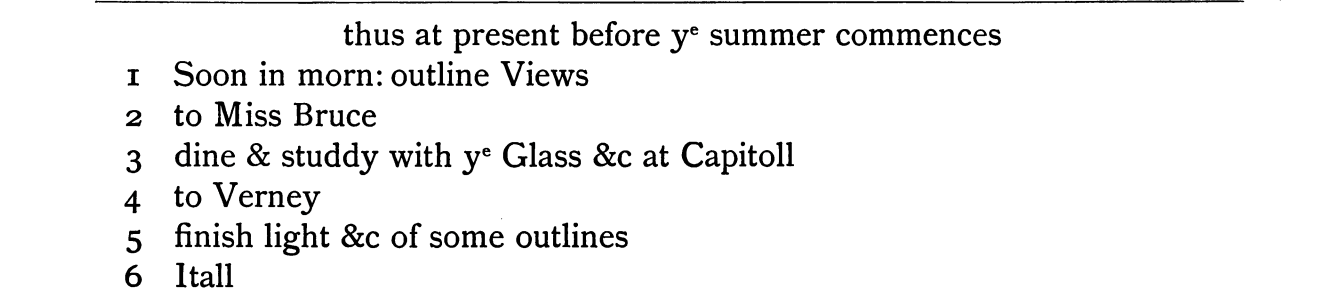
Women provide interesting cases. Overall, they are suppressed—from the male-centered ideal of the Grand Tour; from many of the spaces of the Grand Tour (both educational and professional); and from the entries themselves, which mostly treat for men. Despite this, not only does Emma Hart have an entry separate from Sir William Hamilton, who brought her to Italy and became her husband—as she did already in the 1890 Dictionary of National Biography—but even her mother, Mrs. Cadogan, who traveled to Italy with Emma, has her own Dictionary entry, based on the work of Ford and Ann Martha Wrinch. This is in spite of the fact that Mrs. Cadogan otherwise exists as no more than a short reference in some of the writings about her famous daughter. Ford seems to have been interested in recovering some women. When, in 1964, he sent a sample of entries to Taylor, he pointed to his draft of that for Miss Bruce as the one he thought to be best executed. Before this research, Miss Bruce was just a mention in the painter Alexander Cozens’s Italian sketchbooks—where he noted, in the list of his daily activities, “to Miss Bruce” (see fig. 1).
But Ford—or was it Ann Martha Wrinch?—connected Miss Bruce to a paragraph in a 1750 letter from Horace Mann to Horace Walpole, fleshing out more of an individual, a young woman painting in Italy. Mann’s letter is written at the young artist’s expense, mocking her as “a virgin” easily offended by naked statues and figures in painting.8 Is Ford reproducing Walpole’s text in some shared humor, or is he struck by the singular presence of a woman’s name in Cozens’s sketchbook or by the unusual fact of a young woman studying painting in Italy? It is hard to say, but such moments make the Dictionary a more inclusive resource that made possible a database containing hundreds of women’s entries. As Catherine Klein and Lauren D’Ignazio put it, “what gets counted counts.”9
With his archive, more than other prosopographies such as the Dictionary of National Biography or the Dictionary of British Architects, Ford was interested in the connections and overlaps between travelers—what he refers to as cross-referencing and cross-indexing. When asking Taylor in 1964 about the inclusion of illustrations, aside from portraits of the travelers, Ford proposes lists of artists and events in any given year, suggesting a tabular format because “it would be very useful to show which years are fully covered by detailed journals.”10 Taylor approved of the idea, assuring him that they could provide diagrams, but, again, this did not come to pass.
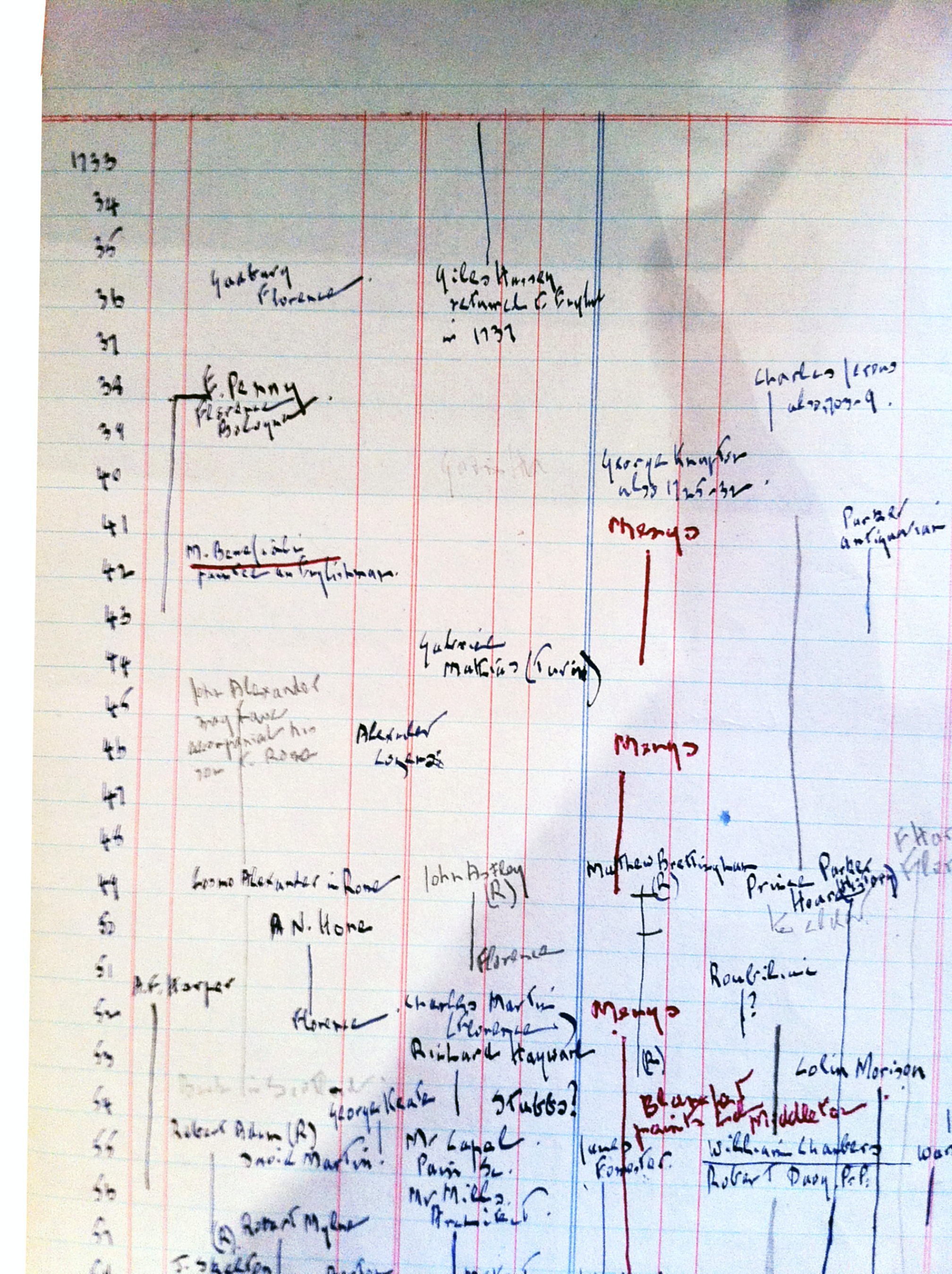
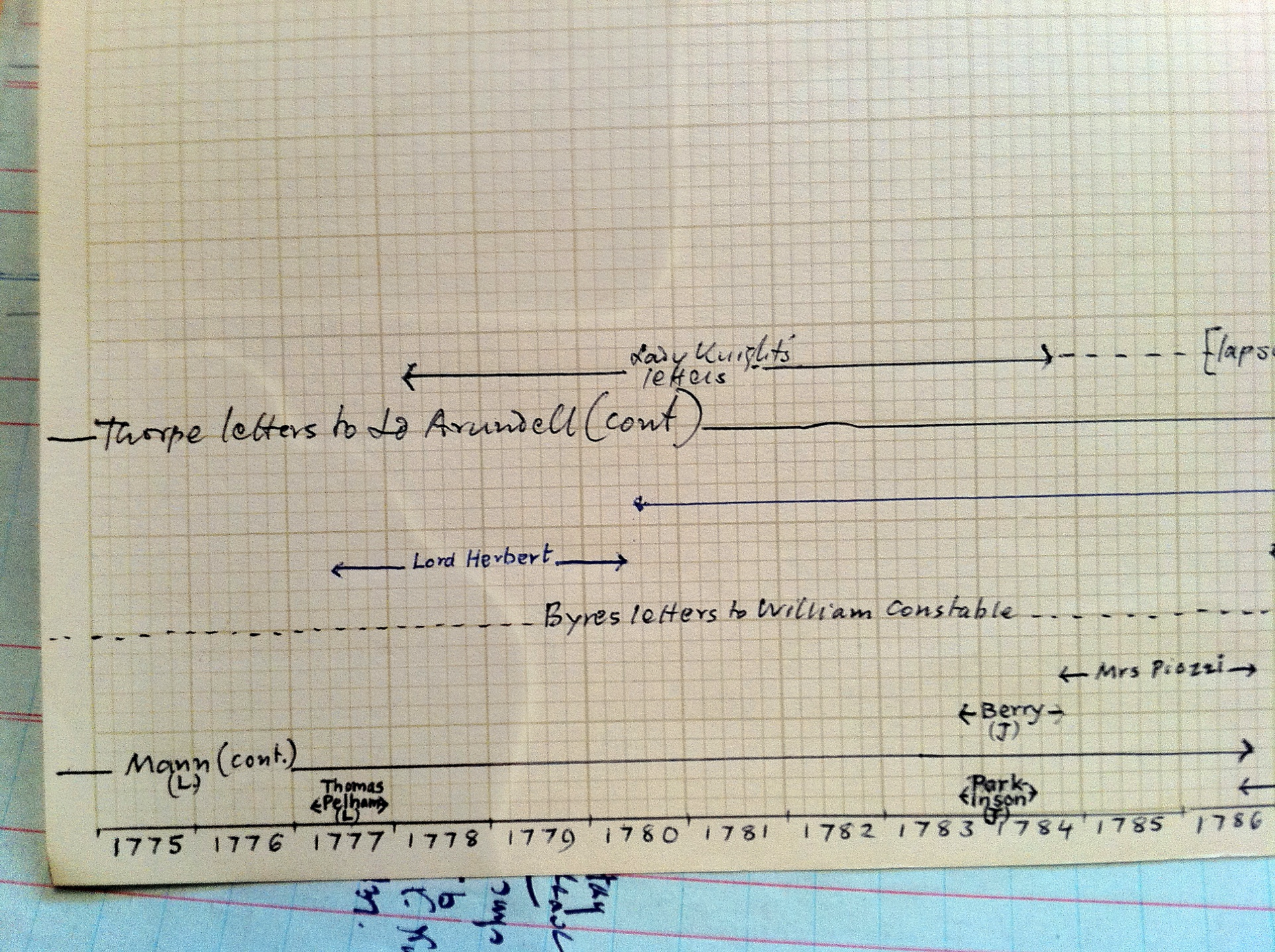
Yet, preserved in the Ford archive are sketches of timeline visualizations with which he was already experimenting. A couple of sheets of paper stand out among the various travelers’ folders (figs. 2 and 3). The first, in Ford’s hand, captures a timeline sketch, visually recording and organizing information about travelers’ arrival and departure events and giving a glimpse of overlapping travels of artists in Italy (in Florence and Rome, in particular) from 1733 to 1759. The other, in Wrinch’s hand, is dedicated specifically to the 1770s and organizes information horizontally, with attempts to represent different types of temporal information (continuity, uncertainty, etc.) using different line designs—dotted or solid lines, lines ending in arrows or brackets, and so forth. As Ford was trying to manage what seemed an overwhelming and still-growing amount of information, one way to approach the “snowball” of the Dictionary was visualization—an approach taken up in earnest in the Grand Tour Project and A World Made by Travel.
The Grand Tour Project
The first idea for a computational project drawing on the Dictionary came from an archival discovery made while looking for an answer to a different question, as so often happens in research. In the spring of 1998, as a graduate student, I found undetected on an open access library shelf the manuscript of a travel narrative, in the form of a handwritten annotation to an eighteenth-century published travel account. The manuscript was detailed, compelling, and anonymous, and I could not determine who composed it. The author identified himself as “an English gentleman who visited Sicily out of a curiosity natural to travellers,” and the dates for his travel to Sicily were in June 1766.11 The Dictionary had just been published, and I searched it extensively for a traveler who was in Sicily in June 1766 to no avail. It was frustrating. Just at this time, we had started experimenting with using and searching large quantities of digitized texts—such as a CD-ROM with the entire corpus of Greek literature. In this context, it seemed natural to imagine a way out of this frustration with a digital version of the Dictionary that one could browse and search at will.
While my work on the mysterious traveler continued in physical archives, it was only a decade later that the Grand Tour Project began in earnest in the context of the collaborative Mapping the Republic of Letters (MRoL) project, where a group of scholars experimented with computational modes and historical research. I was among the MRoL’s founding faculty group, which soon expanded to include students, other researchers, and specialists in technology, particularly in design and visualization. Together we started working with data and thinking through data collection and categorization, spreadsheets, and technology, while learning about collaboration, visualization, and the balance between qualitative and quantitative approaches when using computation.
Mapping the Republic of Letters
The idea of the respublica literaria, or Republic of Letters, originated in Renaissance humanism but persisted throughout the eighteenth century in various forms, from provincial academies to early modern colleges, art societies, and the worldly social sites of cafés and salons. At any given time, what held it together—bridging often stark cultural, political, linguistic, and religious divides—was the exchange of words, things, and ideas, for which written correspondence was essential. An “imagined community” vividly meaningful to its participants, the Republic of Letters—together with its various embodiments—is difficult to track in traditional records hosted in states’ and institutions’ archives precisely because of its noninstitutional and transnational essence. “The Republic of Letters: Between Renaissance and Enlightenment,” a conference that took place at Stanford University at the very close of 2007, sought to tackle anew the elusive nature of this premodern community of scholars as a precursor to many later intellectual associations, including the modern university.12 Over two winter days at the Stanford Humanities Center, short on sunlight but long on presentations, a twenty-first-century scholarly community of varied disciplinary affiliations and areas of specialization probed beyond the national boundaries and traditional periodization limits within which the Republic of Letters is all too often studied. In this expansive geographical and temporal frame, new explorations of questions about such topics as the role of women or the practices and ideals of the Republic of Letters came to the fore.
These discussions continued to resonate among Stanford faculty well after the conference’s conclusion. In particular, studies of individuals’ correspondences—whose reach across great distances in time and space were made so palpable in maps presented by some of the speakers—opened up new vistas and offered inspiration. These were also the years that saw many digital transformations of archival and printed records, as both primary and secondary sources were migrating into PDFs and JSTOR resources, changing how historians worked. What other possibilities would this type of transformation open up? What would the newly available digitized texts and documents reveal? What would metadata help us to see, at a scale well beyond our painstaking studies of individuals’ correspondences?
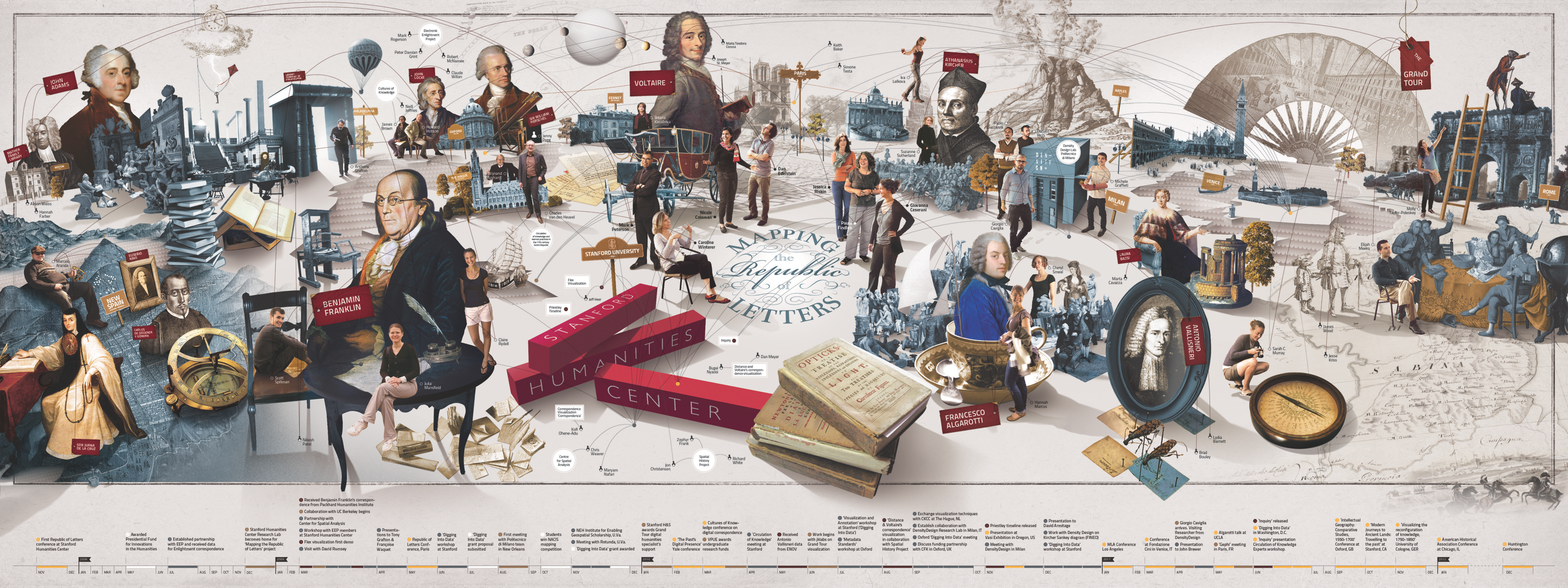
Out of these conversations emerged a collaborative project among a group of Stanford faculty from different departments, including History, French and Italian, and Classics. The collaboration, formally titled Mapping the Republic of Letters, developed around the shared use of computational methods to study varied aspects of early modern intellectual life, drawing on the very different areas of research of each faculty member.13 The initial case studies—including the correspondences of Voltaire (the focus of Dan Edelstein), Benjamin Franklin (the focus of Caroline Winterer), and Athanasius Kircher (the focus of Paula Findlen), as well as my work on the Grand Tour—generated, in turn, collaborations with a number of graduate and undergraduate students and, soon after, a few post-docs, technology specialists, and information designers. This process charted new territory for all involved and, in time, was supported by grants, both internal and external, that made it possible to fund student contributions, travel, and support for external collaborators. The learning curve was as steep as it was exciting. Some of the rewards of these efforts came in the form of connections made outside our usual academic corridors. An early animated visualization of correspondence data developed by a research group of students and faculty in Computer Science at Stanford even ended up on the front page of the New York Times, confirming the importance of thinking in original ways about how we could present our data.14 The same network graphs developed to explore the Republic of Letters, for example, were being used to uncover hidden relations in the Panama Papers scandal.15 New lines of scholarship emerged for the project’s lead faculty and students alike, and alongside one another, we reshaped our learning and research practices.16
The visualization in Figure 4 gives a sense of the diverse intellectual landscape of the Mapping the Republic of Letters project—especially the many connections it fostered—while underlining its unique and experimental visual emphasis. The importance of design and data visualization cannot be overstated. Technology and design expert Nicole Coleman, as the academic technology specialist in the Stanford Libraries and the Stanford Humanities Center, organized the various projects in Mapping the Republic of Letters around this crucial axis and cultivated our collaboration with designers (including with the author of the visualization in Fig. 4). This through line is what made Mapping the Republic of Letters distinct as a digital humanities project, and it filtered into the work of the Grand Tour Project. Giorgio Caviglia, as visiting graduate student first and postdoc later, established the design standards for the project that became the crucial foundation for everything that followed all the way through the creation of the Grand Tour Explorer and A World Made by Travel.
Crucial from the outset was the idea of maps, although over time it became clear that the group’s objectives extended far beyond cartography’s mode of putting information into place. The group desired maps that expressed relations in space and time while remaining attentive to ambiguity and missing data. Together, we came to realize how historical data—inherently incomplete, multifaceted, and carrying constant uncertainty—required ongoing critical reading and assessment in our digital work (just as source criticism is so crucial to traditional historical work). With this guiding principle, we came up against the limits of existing computational tools, which struggle with multidimensional, heterogeneous, and incomplete data. We began to design our own tools and visualizations instead, while conceiving of them less as proofs and more as heuristics for finding the right questions and accurately identifying absences. We worked to make tools that would accommodate our humanistic data, just as we realized that our quantitative approach would need to take into account ambiguities and gaps in our source material.
What distinguished the Grand Tour Project within Mapping the Republic of Letters was the focus on travels rather than correspondence—in particular, the movement of British travelers to and around Italy in the eighteenth century. These travels did involve letter-writing: there were letters of introduction and letters sent home to recount travelers’ experiences, some of which were later published. The Grand Tour also entailed a vast movement of objects and knowledge, and in this, it played a fundamental part in the Republic of Letters, from its inception to the Enlightenment. But fundamentally it was about the actual travelers, moving on the ground along the same developing European roads that were taken by postal couriers who carried written letters through Europe. The Grand Tour experience was an essentially spatial one, and maps have long served to represent it. Yet, in the Grand Tour Project, the relationship between digital visualizations and geographical maps has been a testy one, and it remains a work in progress. Just as maps became less and less the focus of Mapping the Republic of Letters generally, so too for the Grand Tour Project, which increasingly focused on the travelers themselves. The flight charts that initially seemed to work for letters never did for travelers, and the problem of missing travel data immediately became clear in early spatial visualizations. And while the correspondence-centered projects focused largely on existing metadata (information about the circulation of letters, made available in novel digital repositories), the Grand Tour Project set its sights on drawing data about travels from a print source, the Dictionary.
Initial Data Collection
That one could approach the Dictionary’s structured information as data was already apparent from Brinsley Ford’s speculations about tabular representation of the travelers. But actually making a database out of the Dictionary was a novel enterprise, and its beginnings were a humbling experience. Email threads from the summer of 2008 show the improvisation that marked the early days in which the project was taking shape. This was the first venture into data-focused work for both the faculty and students involved, with the collaborative character of the project emerging in part from the need to learn together. Many group meetings and conversations focused on how to extract data from the Dictionary’s pages. There was also a growing realization that the issues were as much conceptual as technical, and that capturing data is as much about how to categorize and ask questions of it, as about the systematic, repetitive work of tabulation.
There were certainly technical adjustments, as well. For example, early emails included reminders to install new versions of Microsoft Access on laptops before meetings so that the database to be filled could be downloaded. Although such issues seem quaint now, some remain central to questions of accessibility and sustainability whose significance is even clearer now than it was then. For example, the Apple collaboration platform that we first used is no longer supported—and therefore that documentation is now lost.
As for structural and conceptual issues, the database was designed to be filled with columns for each traveler that, given the original interest in mapping, privileged spatial information. This design was based on our understanding of the Dictionary at the time, which was mostly informed by the better-known individuals and travels it represented. We created a column for cities visited and for places stayed, as well as columns for relevant temporal information, such as dates of arrival and departure and a column to be checked when the dates were estimated (rather than confirmed). As the work progressed, however, this structure quickly came under pressure. The questions posed in our email threads attest to growing issues: what to do if there are more than ten cities visited for a given traveler? What about a traveler who went back to the same city at different, but unclear, times? How to handle multiple spellings of the same city’s name? What can count as an “estimated” date? And again, we came up against the uncertainty of time: what if only an arrival date is known, or if it can only be estimated, or if only the year is indicated? What to do if an entry registers a traveler as “just passing through” somewhere and no year is indicated?
Some of these questions could be easily addressed—or, at least, seemed easy to address initially, such as by adding additional rows or columns to allow for the inputting of more information. Yet new entries often introduced new idiosyncrasies. Even the issues that seemed straightforward began to introduce a level of ambiguity that called into question the soundness of our database structure and how usefully it could serve increasingly complex data. Similar questions cropped up when we turned our attention to retrieving biographical information. The initial database design assumed minimal information collection: a column for the traveler’s name, a column to check to indicate aristocracy and one to indicate gentry, a column for nationality, and a column for expertise/profession. But even this limited scope soon came under pressure: if a traveler’s nationality is not clearly indicated, should they be assumed to be British? What should one do with double titles? And if the person is only given as “probably” X? The system began to look very clunky. Working for a solution with technology colleagues proved difficult: we were not interested in “normalizing” the data in the interest of statistical analysis. But slowly—intent on capturing and representing ambiguities and nuances—we were constructing a new approach to data curation.
It is sobering to remember that we initially expected the creation of a database based on the Dictionary—the entering of basic information regarding the travels and characteristics of travelers—to begin and end in the summer of 2008. When summer was over and the academic year had started with the work far from done, we had to bring on more members of the team to help with the database creation. By October, we had gotten as far as the letter C at one end of the alphabetically organized Dictionary entries, and the letter V at the other. But the complexity of the project had also increased, and the time it was demanding had grown. By February 2010, we were looking for an undergraduate research assistant to help us finish data entry from the Dictionary. We also had enough data to start visualizing it, along with the other projects in Mapping the Republic of Letters.
Experiments in Visualization
Dynamic data visualizations and the integration of design within humanities research have become hallmarks of the work done under the umbrella of Mapping the Republic of Letters, continuing all the way into A World Made by Travel. When we started the project, extraordinary breakthroughs were already coming to fruition in data-driven computer graphics and dynamic programming languages for browsers.17 The first visualizations dedicated specifically to our Grand Tour data involved working with a GIS or geographic information system, at a time when the application of GIS to history—and digital history in particular—was accelerating and drawing critical reflection. The volume Placing History: How Maps, Spatial Data, and GIS Are Changing Historical Scholarship, edited by Amy Hiller and Anne Kelly Knowles, had recently been published, and we were in conversation with another Stanford lab, the Spatial History Project, where Richard White, Zephyr Frank, and Erik Steiner had led inspiring, collaborative, and innovative research with GIS and dynamic visualizations.18 For the Grand Tour data, GIS ultimately proved not to be a fit, but as the first visualization we attempted, it represented an important step forward.
Thinking about the tours as routes, and excited about the few thousand travelers for whom we had data, we began to search within the data for “polylines”—lists of points, made of single lines drawn between consecutive points—which form the basis for historical GIS route mapping. The resulting visualization, a mass of lines, was a reality check (see fig 5). This map shows all connected Grand Tour travel data points in “raw trip segments” for the entire eighteenth century superimposed on the Italian Peninsula. It certainly gives a sense of richness of the data set, but it is hard to make sense of beyond that. A viewer wonders what the jumps along a straight line from one place to another could mean, how many travels or travelers it depicts, and what its temporal dimensions are, both for the length of individual travels and for when the travel occurred.
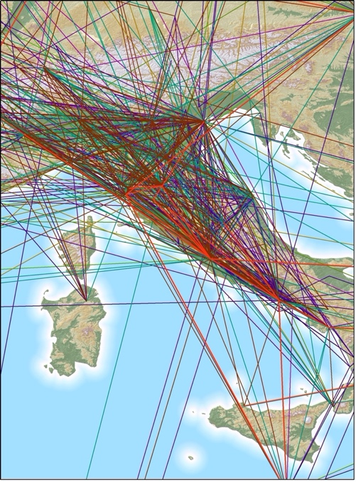
The visualization also raised questions about inconsistencies in the data itself. For example, our database organized travel information in terms of time spent in a particular location, with dates marking the beginning and end of the stay; in the case of uncertain records, these at times produced overlapping dates. In terms of GIS, these became negative stays which could not be mapped. Nor did it make sense to see the travels visually resolving in the connection of two destinations when we knew that such a representation was more indicative of missing data than of any actual travel.
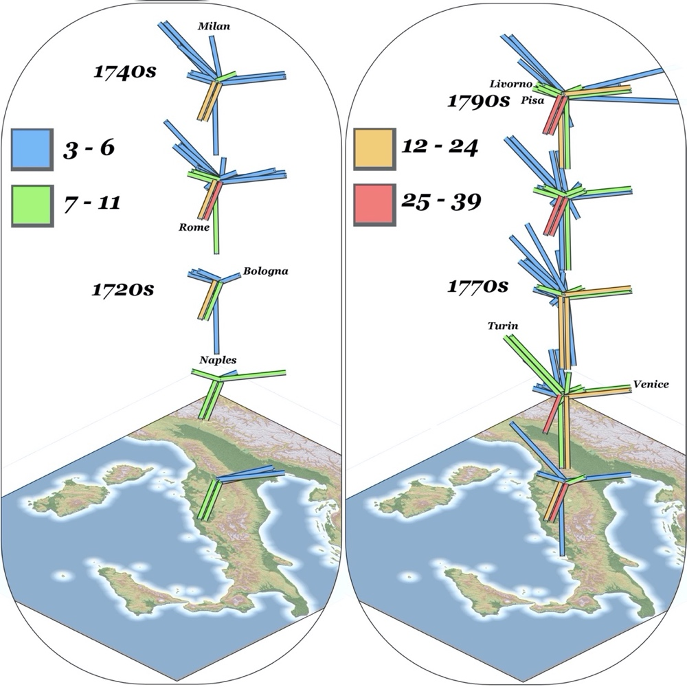
The next experiment with GIS visualization focused on travel out of a single destination, as well as on variations in travel patterns over time. Figure 6 shows changes in the destinations of travelers heading out of Florence over different decades. Yet, even in this visualization, questions persisted about what was actually being visualized. For example, Milan might have appeared as a different destination from Bologna, but many would have reached one through the other, making it difficult to count them separately. What the map might show, therefore, had just as much to do with what might have happened in the actual travels as with what was recorded.
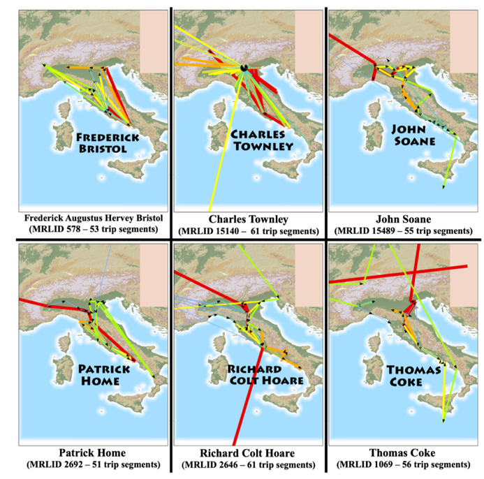
A subsequent experiment focused on individual, better-known travelers, whose movements were better documented and therefore offered more data. But these remained hard to read, affected still by the straight line that glided over or misrepresented missing data points (fig. 7). Although suggestive for considering multiple travelers together, the visualization did not actually facilitate meaningful comparison between them.
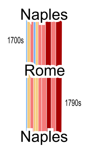
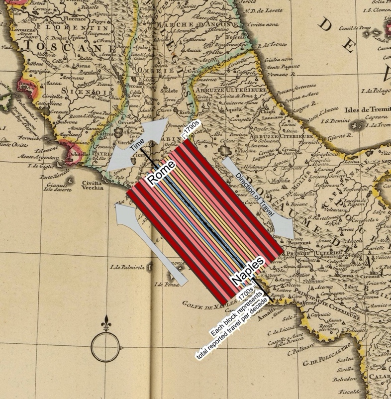
Given the problems with visualizing multiple segments of tours for multiple travelers, whether geographically or as vectors, the next and final experiment focused on a distinct and direct route. We picked the route between Rome and Naples because it is well attested and one of the most direct. Figure 8 illustrates combined multiple features: quantity of travelers on this route through time, directions of travel (whether Rome to Naples or Naples to Rome), and a sense of the geographical space. But many questions about its readability lingered: Why was the chart on the map? What meaning did the colors carry? How many travels were depicted?
Certainly, there are ways in which GIS can be, and has been, of great use. Ultimately, the Explorer utilizes both a general map showing all the locations attested in the travel data and a minimap accompanying every entry that shows the locations visited by each traveler. Moreover, the place coordinates data is shared along with the rest of the database. Once its gaps and limits are clear, the Explorer travel data can serve as a springboard for gathering additional data—if it is available and sufficient—to enable the tracing of travelers’ routes cartographically. Around this time, Sarah Murray from our team reconstructed the map of the travel of a single tourist (fig. 9), painstakingly using GIS to match all sites mentioned in the travel account published by Richard Colt Hoare on a map of Sicily and thus tracing his tour of the island in 1790.
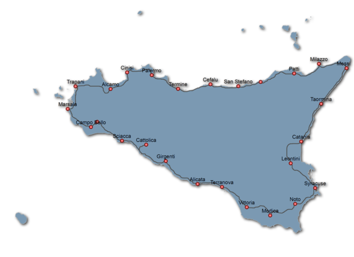
The process required detailed sources that are rarely available and usually only exist for a certain type of traveler, like Hoare, who traveled to Italy with great wealth at his disposal and left an unusually precise account. Even for these travelers, one must go beyond the Dictionary to collect enough data to make it worthwhile to trace locations cartographically with GIS.19 We simply do not possess the necessary detailed information, inside or outside the Dictionary, for the great majority of travelers. After these first experiments with GIS, we undertook new efforts designed to give us a better handle on our travel data beyond plotting locations in cartographic spaces for which they were a poor fit. For the Grand Tour in particular, given the nature of our data, we soon realized how much our work in visualization needed to be about addressing what was lost, incomplete, and uncertain.
As visualizing the data became a major focus of our efforts, doing so helped us take stock of the vagaries of our source, the Dictionary, and appreciate the fact that much about the majority of these travelers and their journeys has been forgotten or remains altogether unknown—as opposed to the well-known individuals whose travels are well-documented in the Dictionary and beyond. The greatest value of our visualizations lay precisely in their ability to show us the shape as well as the limits of our data, while simultaneously enabling us to look closely at various individual travelers and what the Dictionary recorded about them. Perhaps most important was the realization that even if we were to have many routes traced out on historical maps, this would still not tell us much about the intellectual geography of the Grand Tour—of which the very patterns of what is remembered are also a part. How did the Grand Tour change over this period? What were the variations or overlaps among its individual practitioners? How did these differences or similarities relate to the travelers’ social status, expertise, or gender? These are the questions we need to ask to get at a big picture of the Grand Tour, and these are the questions that have been mostly neglected by a tradition of studies focusing on the most prominent individuals. And these are the questions that would come to animate A World Made by Travel, after first emerging in the form of data questions at early stages in the project.
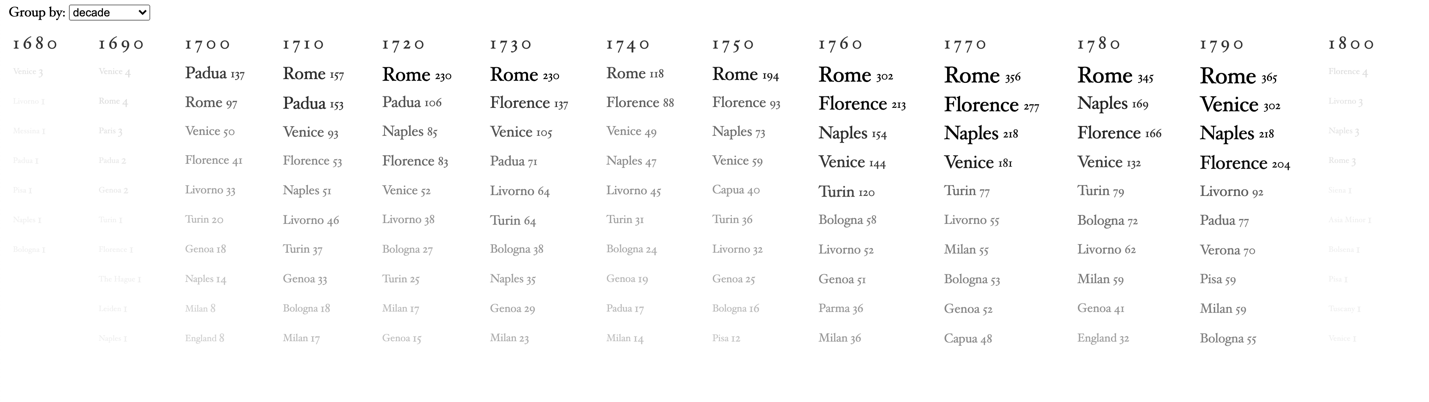
Visualizations such as figure 10—illustrating patterns in relative prominence among the most visited destinations across the eighteenth century—helped us better grasp the patterns in our data and the overall shape of what was preserved and what was lost.
* * *
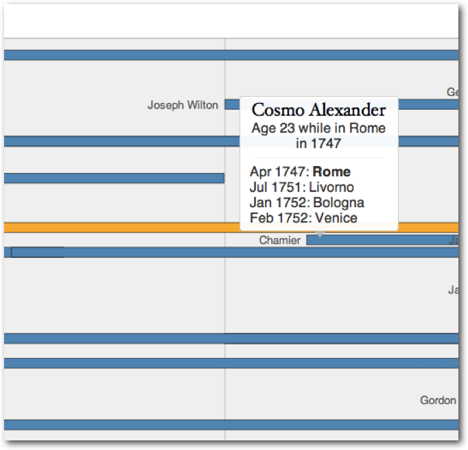
One challenge—as part of an ambitious visual approach to the whole Dictionary—was to visualize the rich biographical and travel information in our data set in order to produce a big-picture view of the Tour as recorded in the Dictionary, without losing sight of the individual. With this in mind, we devised and developed the prototype for an interactive timeline model for eighteenth-century British and Irish travel to Italy. Figure 11 is a snapshot from our Priestley timechart.
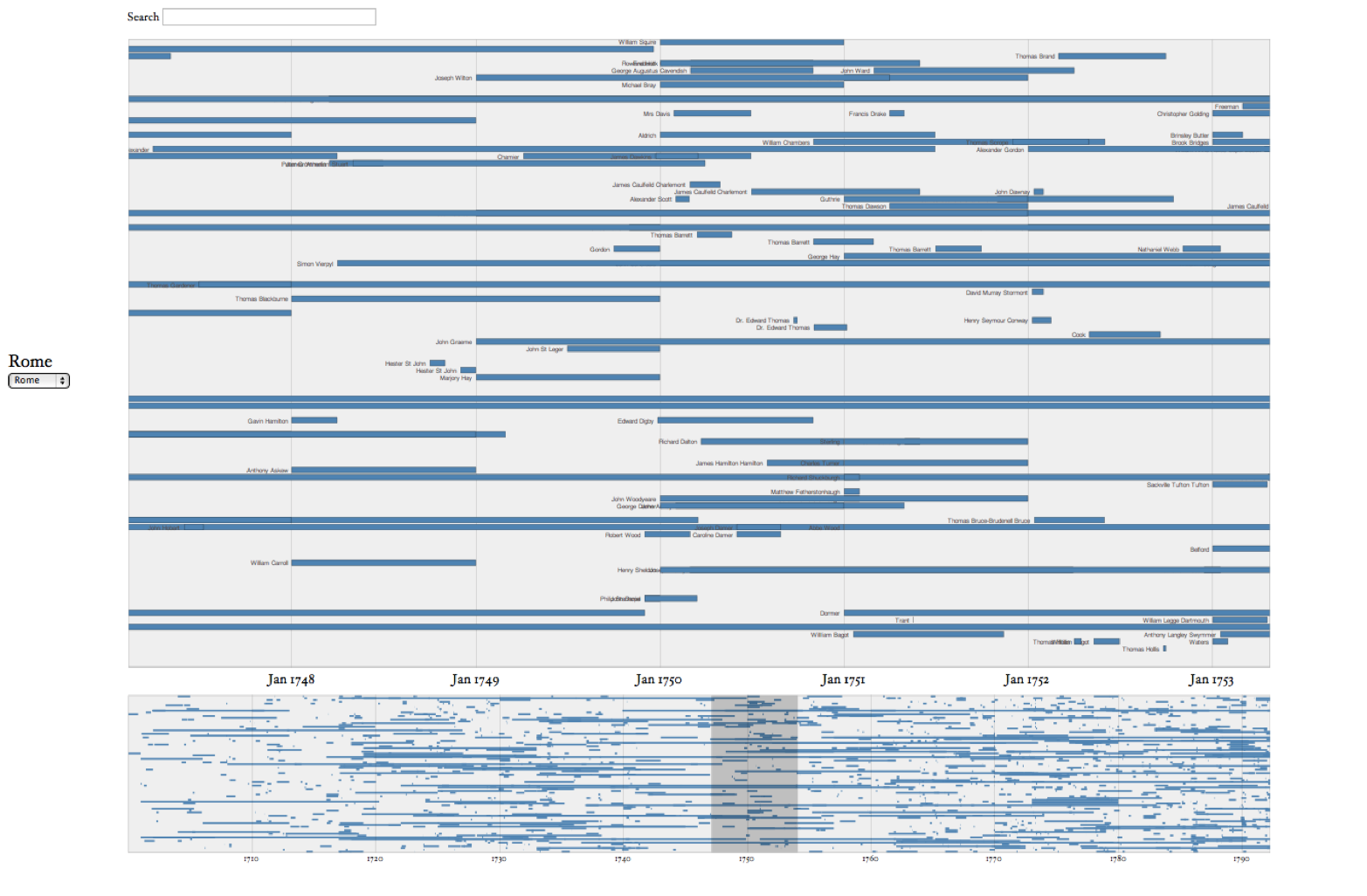
The focus here is on Rome from 1748 to 1753, where every blue line represents the extent of a visitor’s stay in the city. The lower band lists visitors to Rome from entries ranging across the full period from 1700 to 1800. However informative, the latter is too dense to make much sense of, though one can select and zoom in on an adjustable shorter span of time, which the upper band then displays.
The origin of the layout here may be Joseph Priestley’s famous Description of a Chart of Biography (1764), but Ben Fry’s The Preservation of Favoured Traces (2009) provided inspiration for the interactivity. Whereas in Priestley’s timeline each line represents a lifespan, every horizontal bar in ours represents the length of a visitor’s stay by place. Priestley published a detailed account of his thinking behind A Chart of Biography, which he advertised as revolutionizing how students learned about history.20 A Chart of Biography, produced in a large format (two feet high by three feet wide), was designed to show a comprehensive view of the lifetimes of historical figures and how they stand in chronological relation to one another. Displaying two thousand lives over a period of three thousand years, Priestley conceived of the graphic chart as ideal for quickly capturing the relative length of the lives and the intervals of time that elapsed between them. All these principles of layout were applicable to how we wanted to explore the Grand Tour travels, although we found it more manageable to filter trips displayed on the timeline by city. In the view for each city, each colored bar represents a traveler known to have visited that city. Each traveler’s bar extends for the amount of time that he or she is known to have been present in the given city. Particularly inspiring was Priestley’s method for showing uncertainty for dates by using a broken line or with dots at the beginning or end of a lifetime when the year is uncertain. We considered implementing a similar gradient to show uncertain start and end dates but ultimately decided against it. To attempt to define an algorithm for each different type and degree of uncertainty in dates could end up being misleading rather than helpful.
Priestley chose the large format size of his printed timeline to match the density of information of his data. At the time we created our timechart, we were working on laptops with only a 1440 x 900 pixel screen resolution and, in our lab, a thirty-inch Apple Cinema Display at 2560 x 1600, which could not accommodate the full scope of travels at once. We took advantage of the digital display to manage the number of trips shown dynamically. We built the Priestley timechart with what was at the time the most sophisticated graphical tool kit for visualization, Protovis. Central to the adaptation to interactive graphics was the “Focus + Context” technique, which made it possible to show the full chart of travels for the entire eighteenth century in a reduced size while using a filter brush to highlight an area for closer inspection in the main view. For example, if one selects the period between January 1748 to January 1753, one sees all the travelers for whom we have entries who were in the selected city at this time, as well as the length of their stay in the city (see fig. 11).
The greatest technical challenge we faced in reproducing the layout for A Chart of Biography was the arrangement of the horizontal bars within the vertical space. Priestley had the advantage of being able to place the lines in his chart by hand, arranging them for maximum density; moreover, he was not tied to an existent set of lives but rather had control and choice of whom to include. For us, committed as we were to include all travelers in the Dictionary, there were no readily available algorithms for the kind of ad hoc modeling of the layout that would also accommodate the various travelers’ name labels. Approximating the effect of A Chart of Biography could not completely avoid the collision of labels and trips.
Fry’s The Preservation of Favoured Traces had only recently been released when we began work on the Priestley timechart. In his project, Fry provided an elegant example of what an interactive graphical interface can bring to the reading of a text with the use of scale. Traces gives an abstract view of the full text of Darwin’s On the Origin of Species (1859), showing the pattern of changes over time from one edition to the next. But what makes it an exciting tool for research and pedagogy is that at any point in the text, you can zoom in to see changes at the level of individual words added and deleted with each edition. We used a similar approach adapted to the character of our underlying text. Since our source was not a monograph but a collection of dictionary entries, the individual travel segment was the point of entry that would first (with a mouseover interaction) give context for that travel segment in the individual’s overall itinerary in Italy as well as the traveler’s name and computed age at the time (fig. 12).
By clicking on the traveler’s name, one sees the entire text of that traveler’s Dictionary entry (fig. 13).
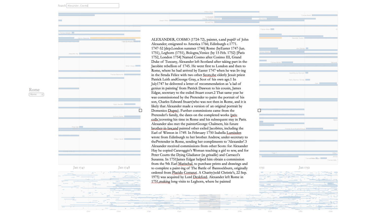
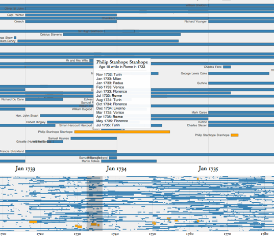
A full-text search of the timechart functions as both a navigation aid and a way to uncover patterns. When typing a traveler’s name in the search box, one sees his or her bar highlighted and immediately gets a sense of who else was in the same city at around the same time and whose trips overlapped. Entering the term architect when looking at travel in Rome highlights the trips made by travelers whose entry includes the term. Though only suggestive, the results reveal significant patterns spread out over the whole century of architects visiting Rome. With the timeline brush, we can narrow that scope to a more detailed exploration of specific periods of time (fig. 14).
There is a lot that the timechart prototype allows us to see. For example, we could readily appreciate seasonal variation in travel or the change in fortune of individual cities of the Tour over the course of the entire century, and in some cases we could relate these changes to specific types of travelers. For example, there were many architects at Vicenza in the first Palladian-influenced part of the century, while many more went to Naples and Paestum later during the rise of the Greek revival.
Certain characteristics of our data also revealed features and biases of the Dictionary. For example, in the case of travel to Padua, we see a dramatic decline in the number of visits after 1730 (fig. 15).
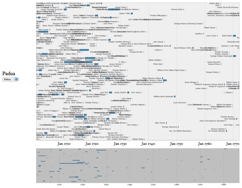
This visible change is because the visitor register for the city was not well maintained after 1730, a condition of the source materials that would be difficult to track using the Dictionary in its printed format. Even if the preface explains this bias regarding Padua, it would be hard for any reader of the Dictionary to realize its impact while reading through the printed entries without a bird’s-eye view such as that offered by the Priestley timechart. The constant presence of the unknown becomes more evident, measurable, and interpretable in this visualization. (The question of the decline of visits to Padua in the Dictionary’s records has remained an important one through later phases of the Grand Tour work, for which see Entering a World Made by Travel and Sweet).
Searching by person—be it Alexander Cosmo or Philip Stanhope, as shown in figs. 12–14—immediately gives a sense of who else was in Rome around the same time. This view identifies people in the same place at the same time in a way that we would never get from the Dictionary. This loose association among travelers is important because we rarely have an explicit connection mentioned in the entries. This visualization gives us the scope to explore possible relations between travelers who share a spatial and temporal context.
The work done for the Priestley Timechart, even as a prototype, raised new questions about our project as a transformation of a printed reference work into an interactive dynamic digital interface. Such unresolved questions included: How should one make use of the “y” axis? How to deal with uncertainty? Would it be possible to display all the towns at the same time? What would that look like? The timechart also unleashed our imagination and pushed us to think about all sorts of approaches for creating new knowledge out of the data formalized from the print Dictionary text. Once we let go of the tracing of historical routes, we could imagine various ways of connecting the dots between our travelers, including by shared interests, biographical information, dates, and other categories. These were all lines of inquiry that we ended up pursuing later.
Case Study: Sixty-Nine British Architects in Italy
In parallel with the other projects under the Mapping the Republic of Letters umbrella, the next phase involved turning to a focused study that could demonstrate the utility of visualization and data work for making an original contribution to scholarship on the Republic of Letters.21 For the Grand Tour, this was a step toward building the Explorer and opening it up to others. We began with a “what” question—“What was the significance of travel to Italy for eighteenth-century British architects?”—to show how historical knowledge and argument can develop out of studying data, but the “how” proved equally consequential. This case study clarified the need to create categories that mediate responsibly between the sources and the research questions, demonstrated the importance of making that process transparent, and showed how insight could be gained by exploring the intersections between data dimensions.
We focused on architects because of my own research familiarity and interest in the topic. My previous work on the history of archaeology in the eighteenth century intersected with these architects. During this time, architects were crucial to the rediscovery, analysis, and representation of ancient classical ruins. They played a distinct role in transforming and disseminating the understanding of ancient material culture that marked the beginning of archaeology as a discipline, and in facilitating the contemporary turn to antiquity characteristic of movements such as new classicism and philhellenism. These architects’ expeditions (today often called “proto-archaeological”)22 to measure and draw ruins in Rome—and then farther south from Paestum near Naples all the way to Sicily, and even farther afield to Dalmatia, Greece, West Asia, North Africa, and the Middle East—belonged to the tradition of the Grand Tour. At the time, architects were the ones with the skills to visualize the past, and I expected them to inhabit the pages of the Dictionary with thick and meaningful connections. Indeed, the sixty-nine architects of our study allowed for a fresh perspective on both the Grand Tour and on the history of architecture.
The Grand Tour architects case study was published in the American Historical Review in 2017.23 The article contains the major research findings from the biographical and travel data analyzed and visualized in this study, including the relationships between destination traveled to and publications planned; between the building of expertise and of social networks for future employment; between aspiring professional architects and amateur architects, alongside their differences in status and education, which was also reflected in travel patterns; and between Italy and Britain, where the architects’ travels created a distinct cultural and spatial zone that influenced the dynamics of family generations, personal fortunes, and career trajectories, which would in turn shape the character of British architecture as both a form and a profession. In short, the article constructed a rich picture of architectural history via the collective biography of sixty-nine architects and the subtle intersections of various data dimensions concerning their travels and lives. What I want to focus on here is how this case study transformed our approach to data, by emphasizing categorization as an interpretative act, as well as the importance of making category decisions transparent for every dimension of the data to help facilitate reinterpretation and modification.
Selecting sixty-nine architects for the case study was a process that itself involved interpretation and categorization. The starting point was word searching the entire text of the Dictionary in its digitized version for the word architect (just as in the example discussed above from the Priestley timechart visualization). This search yielded 117 entries. A quick look revealed that many of these travelers were not architects themselves, but their entries contained the term either because they traveled together with architects or encountered architects during their travels. We took note of the networks these occurrences highlighted but excluded these travelers from our data sets. After scrutinizing the 117 entries, we eliminated 47 percent of the original list, trimming it down to sixty-two. The remaining seven architects in our data set are travelers whose Dictionary entries do not contain the term architect but whom we categorized as architects because they featured in another reference work, Howard Colvin’s A Biographical Dictionary of British Architects, 1600–1840.24
The point might seem obvious but bears elaboration: every inclusion (or exclusion) involves a decision. That is how a data set is constructed and how categories are devised. For the purpose of our study of architects on the Grand Tour, discrepancies among sources are illuminating. Colvin’s work was brought in as the authoritative source on who counts as an architect given his stated goal: Colvin worked tirelessly to identify all the architects he could find, from the famous to the obscure, hunting for architectural drawings in private and public archives. As his research progressed, he expanded the pool in every successive edition from the first in 1954 to the third in 1995.25 Both Ford and Ingamells, along with their collaborators, knew Colvin’s work well; in fact, it is cited as a source for twenty-one entries in the Dictionary.26 Of course, inclusion as an architect in Colvin but not in Ingamells might be the result of oversight. Still, examining the logic of why some of Colvin’s architects appear in the Dictionary as travelers to Italy without the “architect” label is itself revealing. For example, James Byres (1734–1817, travel years 1758–90) and Alexander Nasmyth (1758–1840, travel years 1783–84) are not listed as architects in the Dictionary because architecture was not as important a component of their time in Italy as other pursuits. Byres traveled to Italy in 1758 to study painting but turned to architecture shortly after his arrival; this venture was also short-lived and occupies just a few lines in his lengthy entry. He soon turned to other activities, becoming the preeminent guide to Roman antiquities for much of his very long time in Italy and playing an essential role as dealer and adviser for Grand Tourists in their many collecting activities. Colvin’s account of Byres focuses on the drawings and the (admittedly few but nonetheless significant) architectural interventions he made once back in Scotland. Alexander Nasmyth identified as a painter, but once back in Scotland—possibly aided by his descent from a family of masons—worked in landscape architecture as well, connecting the work to his expertise in landscape painting. This makes him enough of an architect for Colvin. Counting both Byres and Nasmyth as architects in our study allowed us to tell a larger story about the fluidity of architects’ activities in relation to their Italian travels, as well as how need and circumstances affected professional trajectories.
The addition of three other travelers to our list of architects because of their appearance in Colvin introduces a different issue of categorization. All three have well-documented entries in the Dictionary: Sir Andrew Fountaine (1676–1753, travel years 1702 and 1715–16), Thomas Wynn, 1st Baron Newborough (1736–1807, travel years 1759–60), and Hon. Thomas Robinson (1738–86, travel years 1759–61) are typical Grand Tourists—male, elite, and titled. In the Dictionary, they are marked not by any professional association but by their honorifics, family genealogies, Oxbridge affiliations, membership in Parliament, and so forth. Their travels are varied and well-attested, rich in connections and tourist activities, such as posing for portraits, socializing, and commissioning and collecting art—activities that also evinced an interest in architecture. They appear in Colvin because of their influential roles in the history of architecture and the attestation of surviving drawings: Fountaine seems to have planned the addition of a library and music room to his estate; in Wynn’s case, drawings survive attesting to some ability as an amateur architect for his own family seat and that of his brother-in-law; and Robinson planned fortifications against French invasions and other buildings on his own land.
For each of these three, Colvin uses the term amateur architect, a term he himself problematized in the 1993 essay “What We Mean by Amateur.”27 Attempting a definition and an explanation, Colvin stated that the three most reliable criteria identifying an amateur architect are that they are not remunerated for their practice, might not be able to draw the plans themselves (hiring others in part or in full), and would not be involved in the drawings’ actual execution. He concluded also that he would prefer the term gentleman architect as more precise and to avoid the anachronistic use of amateur, which was not included in the original eighteenth-century Dictionary by Samuel Johnson, coming into use only after architecture as a profession was well-established. Certainly, it is as “gentlemen” tourists that these travelers appear in the Dictionary.
Colvin’s discussion demonstrates categorization as an active interpretive process, one all the more charged when dealing with a historical context in which new definitions are emerging. Professional and institutional recognition was an explicit goal for architects in the eighteenth century—John Soane (1753–1837, travel years 1778–80) titled his 1835 autobiography Memoirs of the Professional Life of an Architect—that was resolved only in the early nineteenth century. The biographies populating Colvin’s BDBA tell this history of professionalization, serving as its very data. Colvin had to make choices about whom to include and on what grounds, while also creating distinctions like that of “amateur” architect; the preface reads as both an explanation of his approach and a summary of the professionalization of architectural practice. In our case study, we explored architects and the Grand Tour by letting the data tell the story. We were following and deepening the same impulse that governed earlier biographical dictionaries, revealing a sense of narrative continuity attached to the data and its previous researchers.
These efforts around categorization continued to influence decisions concerning what information to formalize about these sixty-nine architects and how to organize it. We had been collecting data about travelers from the very beginning of the project, but for these sixty-nine, we had a specific focus and research question to explore. This meant that we extended the scope of data collection beyond the Dictionary, which made us all the more aware of its particularities.
We organized the collection of biographical information around three basic data points: name, unique identifier (ID) number, and professionalization status. For all sixty-nine architects, we recorded a personal name (in two cases just a last name, as preserved in the Dictionary) and assigned an ID number, a crucial step for systematizing any data set. For each of them, we also recorded whether they were an “amateur architect,” resulting in a column in the database with a yes/no value. There are twelve “amateur architects” in the database; six are termed as such in the Dictionary, while another three we recovered from Colvin’s BDBA, as discussed previously. Three more are termed “architects” in the Dictionary, but we coded them as “amateur architects” based on how Colvin presents their work in his BDBA. For example, Colvin reported that Richard Boyle, Earl of Burlington, an influential patron and arbiter of architectural taste, “can draw and design as well as pay the bill.” Of Thomas Hope, Colvin states he was “a competent draughtsman but as an amateur architect he confined himself to his own two houses.”28
Building on this base structure, we collected data in four major fields: (1) education, (2) affiliations with academies and societies, (3) occupations and posts, and (4) funding sources—all drawn from both our Dictionary and Colvin’s. Populating these four fields with data involved distinct exercises in categorization. For “education,” the data includes seventeen different “Educational Institutions”; making sense of this variety in a manner that would speak to our research question required creating the new category of “Educational Background,” in which individual institutions are grouped under three headings: “Art Schools” (five instances), “Other Universities and Colleges” (also five), and “Oxbridge and Inns of Court” (seven). The further heading of “Training with an Individual” was created to represent all nineteen instances where apprenticeships with specific artists and architects are mentioned in either Colvin or the Grand Tour Dictionary. Similarly, to make sense of the eighteen architect-affiliated societies and academies that varied in terms of their absolute membership size, establishment dates, and geographic location necessitated the additional category “Societies and Academies by Type,” with four headings under it: “British Artist Societies” (seven instances), “British Learned Societies” (four), “Italian Societies” (four), and “Other National Societies” (three). For the field “Employments and Appointments,” the four subcategories created were “Official Architecture,” which covered all cases found of remunerated architectural work, private or institutional, including service on committees for public work; “MP,” for members of Parliament; “Knight,” for architects who were knighted at some point; and “Military,” for those who served in the military.
The last field, concerning information about the economics of travel, was harder to formalize. It did not rely as directly on information already structured or semistructured in either Colvin or the Dictionary. The category of “Funding Sources” represents a crystallization of what we gathered from Colvin and the Dictionary about how architects financed their tours. Out of a variety of mentions and passing references, we came to appreciate how sometimes architects traveled to Italy thanks to sponsors—whether by their own family firms or private sponsors—and also how taking commissions during their travels served as a form of support. Other funding sources included a few emerging scholarships and their own private wealth, whether inherited or secured from an already-established architectural practice. Five headings were created for this: “Commissioned Work” (counting twenty-two architects), “Independent Wealth” (twenty-one), “Private Sponsorship” (five), “Architectural Family Business” (three), and “Scholarship” (two).
As for formalizing the architects’ travels as data, from the very beginning of our data collection from the Dictionary, the basic format had centered on time and place—specifically, when a traveler had visited a place. We had to distinguish conceptually between “tour” and “trips,” where the former references the whole journey through Italy, and the latter references its segments, visits to particular places. Given that the most common format in the Dictionary would be when a traveler arrived and when a traveler left a place, this needed to be the model: recording for each location a time of arrival and departure, even if a component was missing. We attributed unique identifiers to each trip (segments with a place and time), as well as to each place. For the sixty-nine architects, we have 626 trips and 130 places documented, the latter with georeferenced data; this was the data used for the architects’ case study visualizations and made available for downloading.
While sixty-nine is a larger number of individuals than would usually occupy books on the history of eighteenth-century British architecture, it is not a large cohort. As with any small but thick data set, however, visualizations help clarify on many levels the bigger picture: the individuals and the various patterns emerging from the many dimensions and their intersections. The interactive graph and map visualizations—built in Palladio and custom made to display, peruse, and probe the data—allow readers to seek particular information about both individual architects and societies; additionally, aggregated trends emerge from exploring these visualizations further. The videos explain how we designed these visualizations and what we learned from our visual explorations of the data.
The first video illustrates the map we built in Palladio to show the architects’ travels together with a timespan filter that allows viewers to explore various dimensions of the travel data (video 1). The map on top gives an immediate sense of where the sixty-nine architects traveled; all destinations in the data appear on the map as dots, covering most but not all of Italy (note the much more sparsely covered South) and expanding beyond Italy to places like Spalato on the other side of the Adriatic coast and Athens, as well as to locations in Asia and North Africa. The map also visualizes quantitative information: the dots are sized to represent the number of visits to each destination (the more visited the place, the larger the dot), and hovering over them displays the place name and the number of architects recorded in our data who traveled there.
Below the map is a timeline: every thin line represents an architect’s travel, and its length corresponds to duration, while the time sequence at the bottom orients this measure of time to its respective place in the century. Hovering over a line reveals the name of the relevant architect; these lines become readable as marks of individuals. Moreover, the interactive aspect of this visualization extends to the relationship between the map and the timeline below it: if a viewer selects a section of the timeline, only the travels relevant to that slice of time appear on the map above it. Viewers can run through the timeline across the entire century, watching the animation show who traveled where, with many dots appearing and disappearing, becoming larger or smaller, in a reflection of travel trends over time.
We also built a custom-made timechart visualization for the architects’ travels because there was more that we wanted to visualize about the data than the map with a time filter allowed. In particular, we wanted to compare the architects’ travels in terms of both destinations visited and time spent in these places. We wanted to be able to see the data about place and time of travel simultaneously, appreciate the travels of any single architect in relation to those of the others, and identify the overall patterns that might emerge for the whole group of architects’ travels across the century. Additionally, we wanted to incorporate some biographical data into this visualization so that we might explore emerging trends and their meaning. With this in mind, we built a timechart in which the travels of all sixty-nine architects appear as color-coded bars along with additional data (video 2).
The first noticeable characteristic of this visualization is the choice that we made to let go of cartographic representation for the travel data. We adopted that in the Palladio map, but here it didn’t serve our purposes. This abandonment of the map was true also of the Priestley timechart, but that chart featured horizontal bars showing who was in the same place at the same time. For the timechart of architects’ travels, the focus was rather on duration of stays and variety of travel destinations. Note that all 130 destinations are still represented, albeit with a different principle than their geographical coordinates. When viewers type the name of a location in the search box, only the relevant travel segments are activated; for example, when typing “Florence,” only the orange bars pertaining to travel to Florence for all the architects will appear. Moreover, hovering over the bars displays precise details for each stay in Florence. For example, for John Talman, the first architect traveling in the eighteenth century in our database, viewers will see his first stay in Florence dated November 18, 1709, to April 1710; the second January 1722; and the third July to October 1715.
At first, we expected to mark each of the 130 locations in our data in a different color to emphasize the variety in travel destinations, but we soon realized that such a chart would be unreadable. It became necessary to group locations under a number of visually effective colors. These groupings in turn afforded us additional layers of meaning. The chart’s final version uses thirteen different colors to which each of the 130 locations is assigned. Ten of these colors represent the ten independent states into which eighteenth-century Italy was divided. Scholars of preunification Italy have to remind their readers and interlocutors again and again that up until 1860, Italy was subdivided into a myriad of independent states. Print books contain maps to convey this political reality and often give multiple maps because some boundaries were redrawn several times over the course of the eighteenth century. By dividing our travel locations into colors pertaining to different eighteenth-century Italian states, we managed to convey this historical reality while circumventing the issue of the fluidity of certain regional boundaries. For six of the states, we also created a darker shade to indicate the capital city. In addition, our data includes the category of vicinity, which uses the same darker shade as the capitals in nearby locations. This avoids distorting the reality that most Grand Tourists had long stays in the main Italian cities from which they completed (and recorded) day trips to local destinations. We didn’t want our color coding to misrepresent these excursions—misleadingly indicating travel far into the Kingdom of Naples, for instance, when most travelers by and large did not venture much farther south than the Neapolitan region. Three additional colors stand for categories that are crucial for understanding travel patterns in the world of the Grand Tour. First, we assigned beige to all instances of travel where we know the tourist was in Italy but with no further specification of visited places, such as for most of John Groves’s travels. Second, we assigned gray to all destinations beyond the Italian Peninsula. These range from faraway locales such as Constantinople and Greece and Malta to closer ones like Spalato and Pola. While the latter two would technically be considered part of the Venetian Republic, we marked them separately given the special bureaucratic and logistical efforts necessary to visit. Sicily received its own category colored in brown: the island was politically part of the Kingdom of Naples for most (but not all) of the century, yet it stood separate in the habits and imaginations of eighteenth-century travelers. By clicking on the color tabs at the bottom of the visualizations, each indicating the name of its region, viewers see only the relevant destinations highlighted, an interactive feature that allows the appreciation of distinct travel trends in each of the groupings we created.
Several measures of time—in addition to the aforementioned dates appearing when viewers hover over the bars—are included in the timechart of travelers, showing both the place and date of each segment of travel. On the left side of the chart, the architects’ names are listed from top to bottom in the chronological order under which their travels occurred. Additionally, at the beginning of each travel bar is the first year of travel: for John Talman, the first traveler in our data set, this date is the year 1699, and for Charles Tatham, the last architect traveling in the century, it is 1794. We listed decades to the left of the names in a column, placing them next to the first traveler in that decade. This helps readily identify at which point in the century a traveler is located and the density of travelers per decade. Therefore, viewers can discern immediately that the 1750s and 1760s were the two most traveled periods, each counting twelve architects.
We also wanted to give a sense of travel durations. Similar to what we had done for colors, we had to make adjustments given the disparities in what is recorded. For some destinations we knew how many days a traveler stayed; for others we could merely approximate the months in which they visited. In the end, to maintain graph legibility, we chose the month as the minimum unit of measure; that is, whether one stay amounted to a day or a month, it would take up the same portion of the bar. Here there is inevitably a distortion; for example, we know that Reveley spent from the end of February to the end of March in 1784 touring Puglia, but because his detailed records list as many as fourteen destinations, his trip is depicted as longer than a year. The marking at intervals of twelve at the bottom of the visualization precisely represents months and years only when the accuracy of the data allows (which is not typically the case, a fact that needs to be taken into account). At the bottom of the visualization is a bar marking intervals of twelve; these are to be understood only as approximations of months, since often the minimum measure of one month per location throws off accuracy. Given that each architect’s travels are represented in a single row, two measures for which the bars do not necessarily allow easy reading are the number of destinations reached by an individual traveler and whether a traveler undertook multiple tours. These are represented, instead, by two more marks: parentheses following the traveler’s name contain the numbers of places visited, and a dot following the traveler’s name indicates that the traveler took multiple trips to Italy.
We created two more interactive features to clarify understanding and add further meaning to the bar chart. First, when viewers click on any name, they deactivate the relevant bar. We included this so that viewers could select which travel bars to view more easily; for example, it is easier to compare the two Mylne brothers’ strips after deselecting the trips of Byres, Newborough, and Hadfield. Also, when one clicks the “highlight amateur” box, the twelve amateur architects appear bolded, distinguished from the others so that viewers can appreciate at once how amateur trips differed from professional ones in terms of places visited.
We also used Palladio to build interactive data visualizations for the architects’ biographical data. For the education data we built an interactive graph to visualize the seventeen different “Educational Institutions” that are recorded in our architects’ database (video 3).
One of these “Educational Institutions”—the Royal Academy Schools—was attended by seven different architects, while eight other institutions appear only once. Most institutions are British, but five are Continental, and one is American (Harvard College). In one case, we have only “Oxford,” with no mention of a particular college. To make sense of this variety in a manner that would speak to our research question, we created the new category (and new column) of “Educational Background,” into which we grouped the seventeen individual institutions under three headings: “Art Schools” (five instances), “Other Universities and Colleges” (also five), and “Oxbridge and Inns of Court” (seven). We also added a heading, “Training with an Individual,” to represent the nineteen instances where apprenticeships with specific artists and architects are mentioned in either Colvin or the Dictionary. While we have records of specific institutions attended for only twenty-six architects, by taking into account the “Training with Individual” educational background, we gain educational knowledge for another thirteen of them.
We created a graph to display and explore the educational data using an interactive visualization that allows readers to probe a number of possible associations. One can zoom in to analyze individual architects’ educational paths and to look for aggregated trends. For example, if you click on Thomas Hardwick’s name, you see that he both attended an art school and trained with an individual. If you zoom on his name in the graph, you notice that the same is true of another four architects (George Hadfield, Willey Reveley, Joseph Michael Gandy and Thomas Johnson). Also, it appears that there is only one other case of an architect with two educational backgrounds: James Gibbs, who both trained with an individual and attended one of the universities and colleges in the data set. Interacting with the graph, viewers can easily grasp that we have an educational background for three-quarters of the amateur architects compared to less than half (47.3 percent) of the professional architects; yet, for the latter, we have representation of all four types of educational background, while for the amateurs, we see only two (the socially elite “Oxbridge and Inns of Courte” and “Other Colleges and Universities”).
We built another Palladio interactive graph for our data concerning architects’ affiliations to various associations related to their architectural interests and pursuits (video 4).
Drawing from both Colvin and the Dictionary, we have records for eighteen such societies and academies in the database. These vary in terms of their membership size and dates of establishment—both of which in turns affect how to consider the number of their attestations among our architects—and geographic location. The most prominent in our data is the Society of Antiquaries (founded in 1707 and continuing today), with fourteen affiliates among our architects. The next most prominent, with twelve affiliates, is the Society of Artists (1760–91), followed by both the Royal Academy (established in 1768 and continuing today) and the Architects’ Club (founded in 1792 and active until around 1830), with eleven affiliates. Six societies count only one affiliate. Among the non-British societies, the Accademia Clementina di Bologna (1710–1803) is the most prominent with four affiliates. In order to make this variety speak to our research question, we created an additional category (and a new column) with four types of societies and academies. All eighteen individual associations appear in the column “Societies and Academies by Name,” but in the column “Societies and Academies by Type,” they are consolidated under four headings: seven in “British Artist Societies,” four in “British Learned Societies,” four in “Italian Societies,” and three in “Other National Societies.” For twenty-seven architects, we have no records of any affiliation, but for just over three-fifths of the whole set we do, and in particular we know that twenty-six were associated with “British Artist Societies,” nineteen with “British Learned Societies,” fifteen with “Italian Societies,” and two with “Other National Societies”—the last two being William Chambers and Andrew Fountaine, respectively, associated with Berlin Academy for Fountaine and both the Swedish and French one for Chambers.
The interactive graph we built in Palladio to display, peruse, and probe the data allows readers to seek particular information about both individual architects and societies. Additionally, aggregated trends emerge from exploring the graph further. William Chambers quickly appears as the only one to populate all four subcategories of “Academies and Societies,” followed by three others—George Dance the Younger, Robert Mylne, and Robert Adam—who appear to populate as many as three categories (and they all miss the same fourth of “Other National Societies”). These four architects who hold the most different types of affiliations are all among the better-known architects of eighteenth-century Britain. But understanding the data means that we have to remember that John Talman, whose only affiliation is to British Learned Societies (the Academy of Virtuosi in particular), traveled and lived in the early eighteenth century, before any of the British Art Societies in our data set existed. With this caveat, it is even more telling that in the case of the eighteen who have only one type of affiliation, nine are affiliated with one of the British Art Societies, six with one of the Italian Societies, and three with one of the British Learned Societies. For all of the ten architects who count two types of affiliation, one of these affiliations is with a British Art Society. In the interactive graph, it is easier to appreciate significant differences between amateurs and professionals. One can see how proportionally we have a similar amount of data in this case for both (respectively 58.33 percent for amateurs, 61.4 percent for professionals) but also that all the amateurs together populate only two subcategories; in fact, were it not for Andrew Fountaine’s lone affiliation with “Other National Academies,” they would all belong to just one, “British Learned Societies.” These quantitative measures of the data speak to the stories of professionalization and social dynamics that we discuss in the AHR article.
We built another Palladio interactive graph visualization about the employments and appointments of our architects, based on data that we formalized mostly from free text (video 5). In reading and rereading the architects’ biographical snapshots, we discovered categories recurrent across enough multiple entries to be meaningful for our understanding of the lives of these travelers as they intersected with both professional ventures and amateur interests in architecture. We started taking notes on instances of architects who were compensated when hired by an institution, such as the office of works, whether to serve on committees or to oversee commissions or construction of buildings. We discovered references to architects who were appointed as members of Parliament, who served in the military, and who received a knighthood. In the Dictionary, much of this information appeared in an organized way, often including a defining term and a date, while Colvin’s references were in more discursive form. The variety was extensive, with fewer cues for formalizing these informational categories. To capture this newfound wealth of information, we created the category “Employments and Appointments” and grouped this data into four subcategories: Official Architecture, MP, Knight, and Military. “Official Architecture”—under which we grouped all cases we found of remunerated architectural work, be it private or institutional, including serving on committees for public work—was the most populated. We have this data for thirty architects, a significant number. For the other subcategories under “Employments and Appointments,” we count seven architects in “MP” (“Member of Parliament”), six for “Knight,” and five for “Military.”
Once again, the graph allows researchers to explore individuals’ trajectories and to visualize aggregate trends. For example, the graph reveals that Edward Lovett Pearce is the only architect to populate all four subcategories—appearing in “Official Architecture,” “MP,” “Knight,” and “Military.” Among the amateurs, not even one appears in “Official Architecture,” in line with how Colvin described amateurs as those who did not provide their services for compensation. Amateurs dominate the other subcategories. They comprise five of the seven MPs, meaning that 41 percent of the 12 amateurs architects were MPs versus 3.5 percent of professional architects. The two professionals here are Robert Adam, famous for his successful social advancement through architecture, and Pearce, a member of the Irish Parliament. Knighthood was more common as a recognition of extraordinary service for professional architects. Here, while the amateurs still dominate proportionally (16 percent versus 7 percent), we have a majority of professionals (Chambers, Soane, Taylor, and, once again, Pearce). Yet only the amateur Lord Burlington was elected a Knight of a chivalric order—that of the Garter; the rest were elected to knighthood recognizing their service as architects. Among the five architects counted under “Military,” three are amateurs and two professionals. Pearce is one of these two, while the other is Stephen Riou, who trained as an architect after a military career. Pearce does not appear in Colvin on account of his being an Irishman, and his distinctiveness in crossing the amateur and professional boundary in a number of ways might be related to that unique national context.
Finally, we built a Palladio interactive visualization for the architects’ funding data (video 6). The information in this graph regarding the economics of the architects’ travels was the most challenging to formalize. “Funding Sources” represents our own crystallizations of what we gathered from Colvin and the Dictionary about how architects financed their tours. Out of a variety of mentions and passing references, we came to appreciate that architects sometimes traveled to Italy thanks to sponsors—whether their own family firms or private sponsors—but also that taking commissions during their travels served as a form of support. Other funding sources included a few emerging scholarships and private wealth, be this inherited or secured from an already-established architectural practice. We were able to collect funding source information for fifty-two of the architects.
The formalized category of “Funding Sources” contains five subcategories. Almost equally represented are “Commissioned Work,” which we have for twenty-two architects, and “Independent Wealth,” which we have for twenty-one. These two groupings would seem diametrically opposed, but in fact there is overlap in four cases. More expected are the instances of overlap between “Commissioned Work” and “Private Sponsorship” (of which there are five); between “Commissioned Work” and “Architectural Family Business” (three); and two cases in which “Private Sponsorship,” “Architectural Family Business,” and “Commission Work” all appear. “Private Sponsorship” appears alone six times and once joined with “Architectural Family Business,” which also appears on its own another six times. There are only two instances of “Scholarship,” both of which appear together with “Commissioned Work.”
In the interactive graph, once again, it is easier to explore the “Funding Sources” data and tease out the stories, both individual and aggregated, that the data holds. For example, as mentioned before, in sorting and visualizing, readers can see that all but one of the amateurs funded their travels by way of “Independent Wealth.” They can also see that in the case of the lone exception, Sir Andrew Fountaine, we do not have an alternative data point but rather an absence of information. The narratives and insights that we argued for in the AHR article—about the professionalization of eighteenth-century architecture and its relation to Italian travel, and about the social and family dynamics of these transformations—are all grounded in the data we collected on the sixty-nine architects who traveled to Italy that comprise our data set. The interactive graphs we built are exploratory, helping us—and readers—to visualize and process the sorting, counting, and combining of the categories we created. Despite appearances, these graphs do the work of grouping and sorting, not network analysis. Yet one limitation is that the graphs are not multinodal, which would quickly become unreadable even with our small absolute numbers. Each of the four graphs we built privileges a category and then adds other dimensions for additional sorting. Thus, we made the choice to privilege, in turn, the four main data categories (“Education,” “Societies,” “Employments and Appointments,” and “Funding”) and the ability to sort all of these by “amateur” and an additional category; for example, if you click on “amateur” when looking at funding sources, only the nodes relevant to the twelve amateurs will appear.
Many insights crucial to the arguments we made in the AHR article emerged from these dynamic visualizations. In one such discovery with the timechart—combining travel destinations, timing, and travelers—the rise of the Doric revival was literally made visible as architects rediscovered the Greek style in ruins they explored at Paestum and further south in the Neapolitan Kingdom, all the way to Sicily. Conversely, we could see how the Palladian style—for which Veneto was an important destination—became less prominent over the course of the century, with the notable exception of William Mylne’s travels (which indicate also sibling bond and rivalry, as he went solo to the Veneto region, in contrast to the southern and more expansive trajectory undertaken by his more successful brother). Here we also began to discern, indirectly, a map of architects’ publication projects by who traveled beyond Italy in search of unpublished monuments and ruins. The timechart also visually revealed differences between the travels of amateurs (bars with shorter and more colorful segments) and of professionals (bars dominated by long red segments and overall fewer colors). This speaks to how amateurs, more like typical elite Grand Tourists, spent less time traveling overall but visited a more varied assortment of places and often returned to Italy for additional tours. All these findings are discussed at length in the AHR article, but what is relevant here is the importance of dynamic graphs, timelines, and charts in visualizing travel data and enabling historiographical argumentation about it.
Through this case-study publication, we also experimented with and learned how best to share data. The Stanford Digital Repository (SDR) became available in 2005, just a few years before Mapping the Republic of Letters started its work, and we deposited all data there (https://purl.stanford.edu/ct765rs0222), alongside our data schema (https://stacks.stanford.edu/file/druid:zk774hr3012/schema.pdf), in order to be accountable and helpful to any scholars who might be interested in using it. We proceeded to create an interactive visualization tool dedicated solely to showing the “shape of the data” and, in particular, to what data was missing. This tool was Breve, and like Palladio, it is still available today. The table viewer in Breve allows viewers to see at once all the major data points we have for the architects—the 69 people, the 130 places, and the 620 trips in our database—together with their unique identifiers (IDs) and their various dimensions (each in itself a datapoint). With Breve, it is possible to visually represent missing data in a data set so as to adjust expectations. For the architect data, viewers can see not only how certain dimensions are fully represented (this is the case for the architect names as well as for the IDs and any other categories we assigned ourselves, such as whether or not we considered the architects to be amateurs), but also where the gaps are, especially in the biographical information.
On the project website, readers of the AHR article could also access the data itself; they could read about the rationale for its shape and organization in the schema, interact with the dynamic visualizations, and download the data to address their own questions or interests. Shortly after publication, a digital humanities center in another country—the Digital Humanities group at the Fondazione Bruno Kessler in Trento, Italy—reached out to share their own visualizations of our architect data, which they had drawn from the Stanford Digital Repository—further proof, for us, of the new kinds of scholarly dialogue made possible by data-driven humanities (see fig. 16).
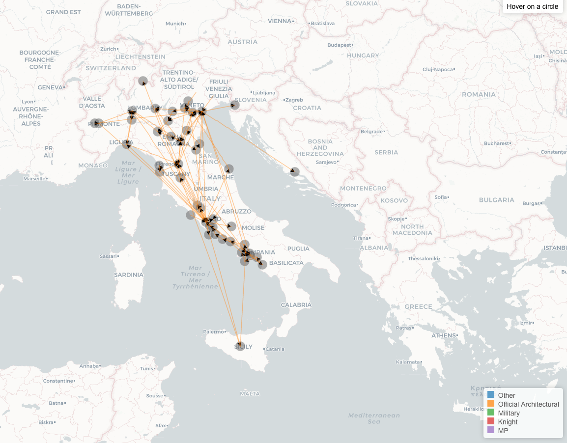
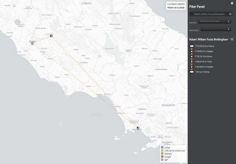
* * *
In one sense, this intense focus on sixty-nine architects, a mere fraction of the Dictionary’s thousands of travelers, marked a departure from our earlier work tackling the Dictionary as a whole. But the experience of tracing a full arc from data collection to publication deeply transformed our overall approach, informing how we went about the digital transformation of the Dictionary and ultimately inspiring the creation of the Grand Tour Explorer.
The Explorer
The case study of sixty-nine architects demonstrated how visualizations could be a means of exploring and revealing irregularities and missing dimensions in the data in such a way as to develop insights and arguments about it. It also made it possible to address concerns about the Dictionary data lacking integrity; even this could be visualized and analyzed. While it became clear that there would never be “complete” data, we discovered what we could achieve by understanding the data’s shape, with even its uneven or missing bits telling a story. Furthermore, what we learned in working with the architects’ data—which we had transformed by adding our own categories and additional information from other sources—is that other scholars would likely work in a similar way with our Dictionary data, transforming or adding to it according to their own research questions. Moving on from the question of data integrity per se—no historical record is ever complete—we recognized that what we most needed was to ensure integrity and transparency in our database construction.
Algorithms for Parsing
Achieving integrity and transparency would mean harnessing technologies, but making this computational turn was possible only because of our accumulated understanding of the print Dictionary and its entries. That much of the Dictionary consisted of semistructured information ripe for a data approach had been the originating impulse for the project. But only by systematically poring over the sixty-nine architects’ entries did a deep sense of the structural relations and repeated patters among entries emerge. With this impression of the Dictionary’s “grammar” in place, it was then possible to craft algorithms—sets of rules—to teach the computer how to parse the text and retrieve information that could be formalized as data. Parsing meant teaching the computer to read the Dictionary through its structural regularities. This resulting approach was much more systematic than could be hoped from a purely manual method. Each new data search and retrieval could be run through the entirety of the Dictionary. It became possible to add cumulatively and organically—especially as new layers of data to be extracted appeared—but in a manner that adjusted the new findings across the database, ensuring a consistency that no one had been able to maintain manually. This was an iterative approach. The machine could learn to complete the work effectively and quickly with an accuracy of about 90 percent in each case—only occasionally running into a feature that was beyond what the algorithm had taken into account. It was, again and again, the human eye that caught the mistake and worked to bridge this last 10 percent and achieve accuracy and meaningful consistency. However, where the computer could parse the entire Dictionary in a few minutes, the human reading and checking was much slower and would lead to further iterations of machine parsing.30
In this way, step-by-step, the work of transforming the printed Dictionary pages into the database at the heart of the Grand Tour Explorer was completed. The computer ensuring consistency proved essential. But the human work of formalizing the data retrieval logic and verifying consistency was equally essential. This proved to be necessary for operations ranging from formalizing dates of birth to formalizing processes that added data dimensions that might not be as explicitly manifest, such as gender. All these steps entailed decisions about category representation, as well as about how to deal with multilayered sources, themselves the result of earlier scholarly decisions about what information to preserve and how. The integrity of this process and of the decision-making underlying it were tantamount to the integrity of the database itself.
Thanks to the Paul Mellon Centre for British Arts in London, I had a CD-ROM copy of the Dictionary that represented exactly what had appeared in print originally. We transferred this document into a plaintext file ready for analysis. The plaintext file was stripped of all font formatting (such as bold or italics), but it preserved spacing, capitalization, and essential punctuation marks, such as parentheses and dashes (fig. 17).
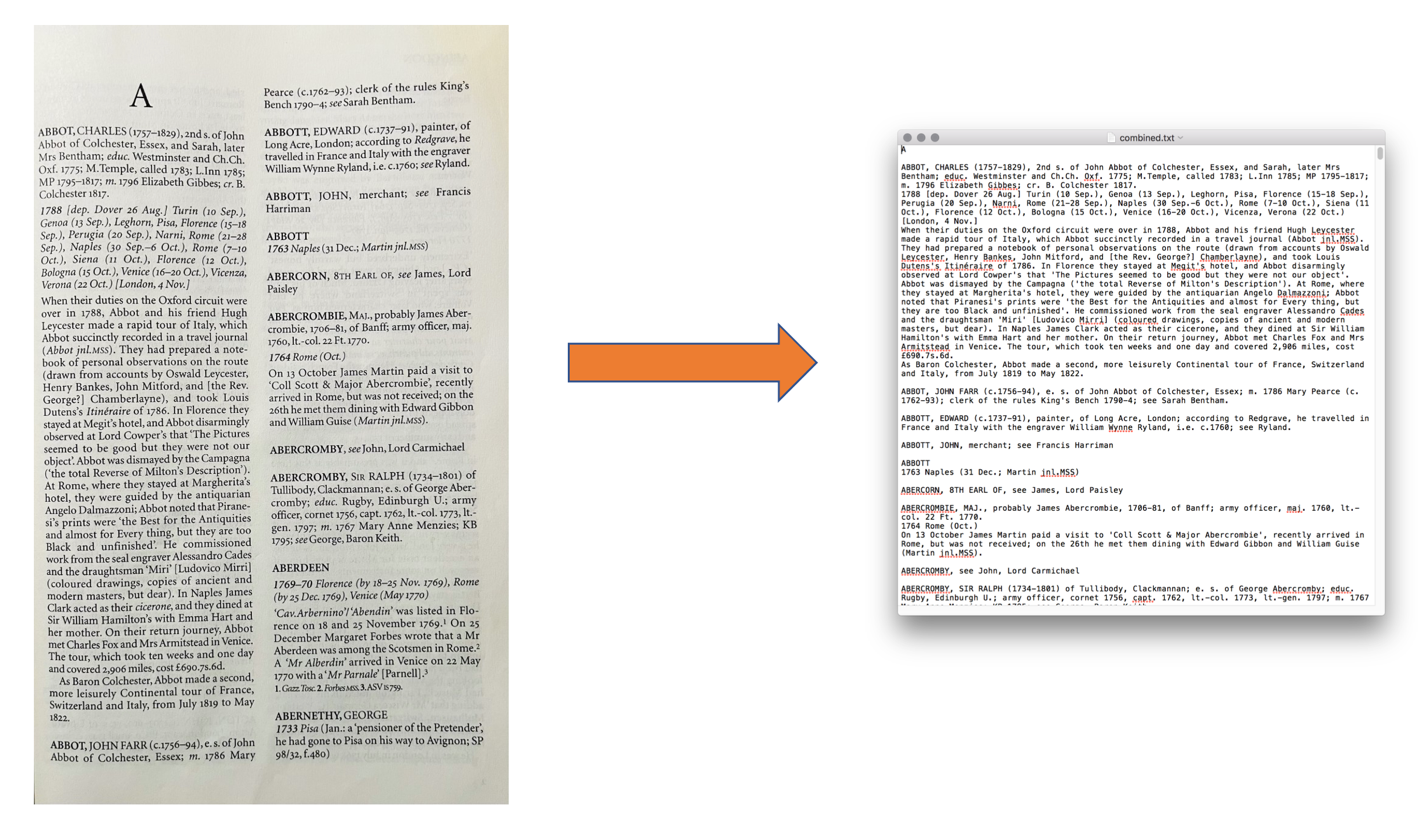
Once we had the text in this format, the next step was to teach the computer to use a combination of Regular Expression and ad hoc scripts to construct the database. The first step was for the computer to “chunk” the text into individual entries and then to further subdivide them into major components. We designed an algorithm that taught the computer to recognize entries by identifying their headings—that is, to look for words (the persons’ names) appearing in all-capitals and followed by a line break, since the Dictionary included spaces between separate entries. Each of the entries identified thus was assigned a unique ID number. Next, the computer was taught to segment entries by their major structural parts, parts by now long familiar to us: (1) the biographical, which is all the text found adjacent to the headings until the first paragraph break; (2) the travels, which is the next paragraph containing the dates and places of the tours and recognizable also because it always begins with the four digits of the initial travel year; (3) the narrative, which is the continuous prose text extending for one or more paragraphs following the line break after the travels paragraph; and (4) the notes, which make up the section following the narrative prose paragraphs and is identifiable because it always begins with the numeral “1” in reference to the first textual note (see fig. 18).
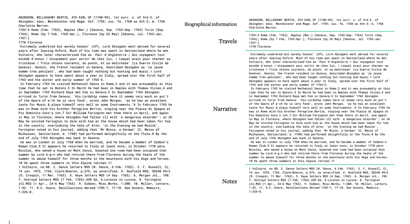
Once the Dictionary’s text was divided according to this consistently applied structure, the focus of the next phase was the retrieval of data from the first two parts—the biography and the travels—again using a combination of Regular Expression and ad hoc scripts. This meant teaching the computer what to look for and what to extract over various repeated runs so that, bit by bit, different parts of the starting text became the organized, transformed data.
Within the biographical information section, the process depended on our recognition that parentheses, commas, and semicolons distinguished discrete information types. Once this was understood, we were able to design rules to teach the computer to separate them accordingly, transforming the extracted biography from layout A into layout B (fig. 19).
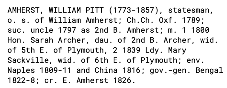
From there, the gathering of biographical data began. The algorithm told the computer to pluck out all sets of two four-digit numbers separated by an en-dash appearing within parentheses and to place the first year as the traveler’s birth date and the second as the death date. Using William Pitt Amherst’s entry as an example, these dates were 1773 and 1857, respectively (fig. 20).

Proceeding in this slow but steady manner, guiding the computer to parse out details and sections according to what we could capture accurately, the database was systematically populated. Like birth and death date, other Dictionary entry details followed a consistent logic that could be structured into rules the computer could follow. For example, one of the features I knew we could retrieve systematically was that of certain family relationships. The Dictionary used often “o. s. of,” an abbreviation meaning “oldest son of,” that was followed always by the parent names (fig. 21).
The computer learned to search for all instances of “o. s. of” in the entries’ biographical section and then to take the name or names that followed and place them into the data group for parents for each relative entry. The computer learned to do the same for “dau,” and “s,” whether or not it was followed by “surv,” “yr,” or “yst” (abbreviations for “daughter,” “son,” “surviving,” “younger,” and “youngest,” respectively) and thus added all this parent data into the database.
Another example is that of marriage dates and spouse names, which were possible to capture by teaching the computer to search for the abbreviation “m.,” used in the Dictionary to indicate marriage, as well as to check to see if there was a one-digit number following “m.,” which indicated a case of multiple marriages (fig. 22a). The computer then captured the four-digit number indicating the marriage year (fig. 22b) and the words following the date, naming the spouse (fig. 22c).


The algorithm was crafted to teach the computer to search for all other consistent abbreviations or words in the entries’ biographical sections that would allow the retrieval of what could be structured into data fields for education or occupation. Still looking at William Pitt Amherst, we see that searching for one of the abbreviations used for Oxbridge colleges (“Ch. Ch. Oxf.” is “Christ Church College, Oxford”) would yield information about this traveler’s education (fig. 23a), while searching for “gov.-gen” (governor-general) would give information about his occupation (fig. 23b).
The front matter of the print Dictionary contains many of the abbreviations that appear in the biographical section of the entries, facilitating this parsing technique. But for the travel section, there is no such guide; identifying regularities to discern any organizational grammar from which to craft an algorithm had to be done from scratch. This section, on the surface, appears to be structured more intuitively than others—after all, the travels list contains a series of dates and places—yet it required more interpretative work, such as figuring out how to identify multiple tours, recognize cases of nesting, and deal with numerous uncertainties and inconsistencies. Here are a few examples of how this worked.
The first step, again, was to isolate the travels section from the rest of the entry (fig. 24).
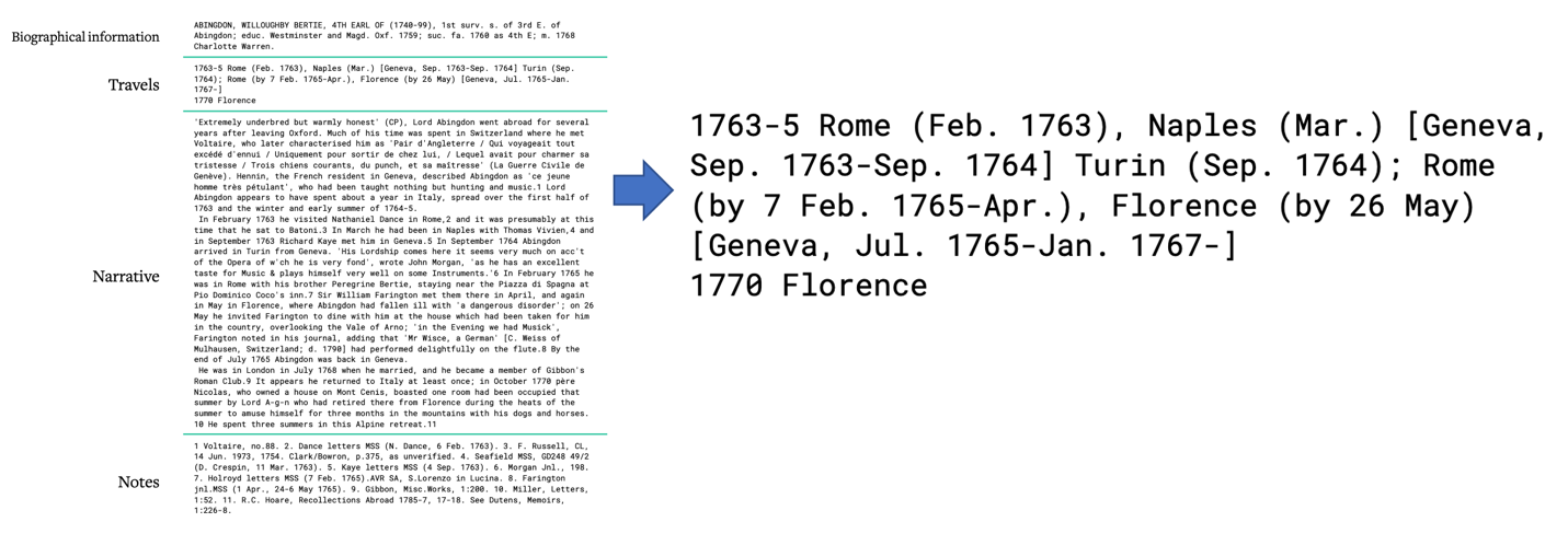
The next step was to teach the computer to identify the tours by searching for lines starting with a four-digit number, which indicated the year of the tour. For Bertie Abingdon, the parsing found and filled in the data for two tours, one in the years 1763 to 1765 and a second in the year 1770 (fig. 25).
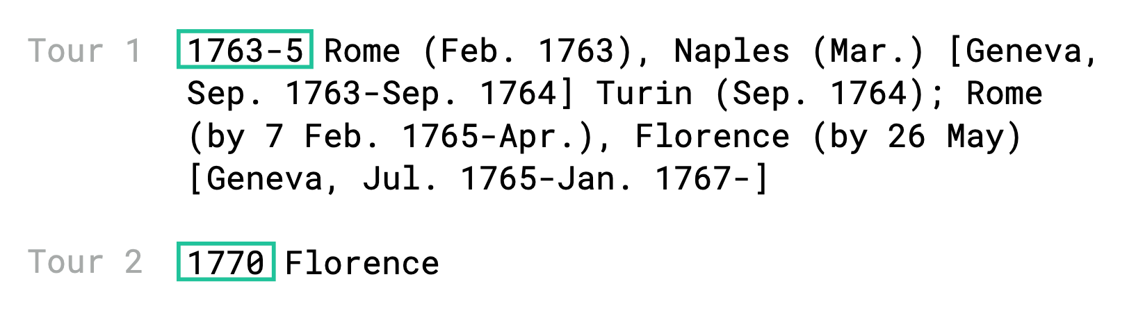
Then the algorithm instructed the computer to isolate any information separated by punctuation that delineated different units of time and locations (which I eventually chose to call “visits”). The information in square brackets had to be treated differently from that in the Italian tours, as it became clear that square brackets were used in the Dictionary to mark destinations outside of Italy (fig. 26).
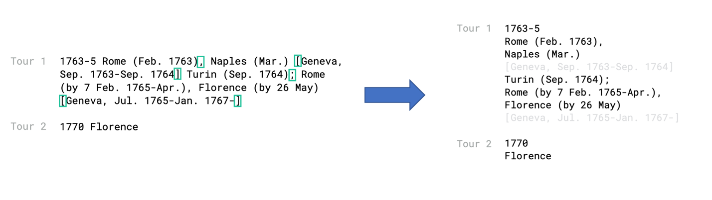
One of the harder things to figure out was how to teach the computer to distinguish locations from dates clearly while still creating a structure that maintained the intersection of time and space that makes travel what it is: movement through space in time. This required first teaching the computer to separate location and time information, placing in one column the recorded sites of travel and in a different one the relevant dates. By this logic, the next step was to create an algorithm to supplement missing temporal information, deriving the missing dates from the known information preceding or following it so that each location could be associated with a corresponding time frame. In the case below, for example, given that we know the traveler was in Geneva by September 1763, for the previous location, where the entry only notes “Naples, March,” the algorithm taught the computer to deduce that this must be March 1763 and not 1764 (fig. 27).
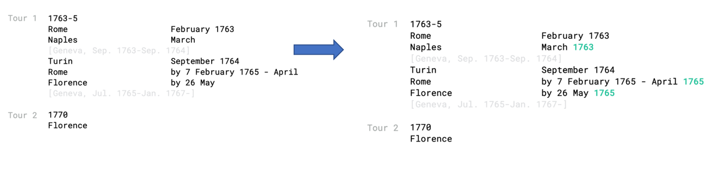
Next, the algorithm instructed the computer to extrapolate both an arrival date and a departure date for each location, making sure to record any additional markers used in the print Dictionary text to specify time, such as “by” or “before”:
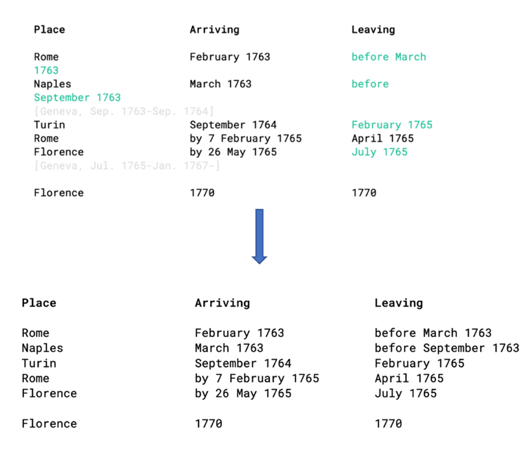
Figures 17 through 28 represent the data retrieval process from a single entry to explain, via visualization, how the parsing worked through the structure and gaps in the Dictionary’s entries to create the database. Figure 29 is a screenshot showing what this parsing process looked like in terms of computer programming code.
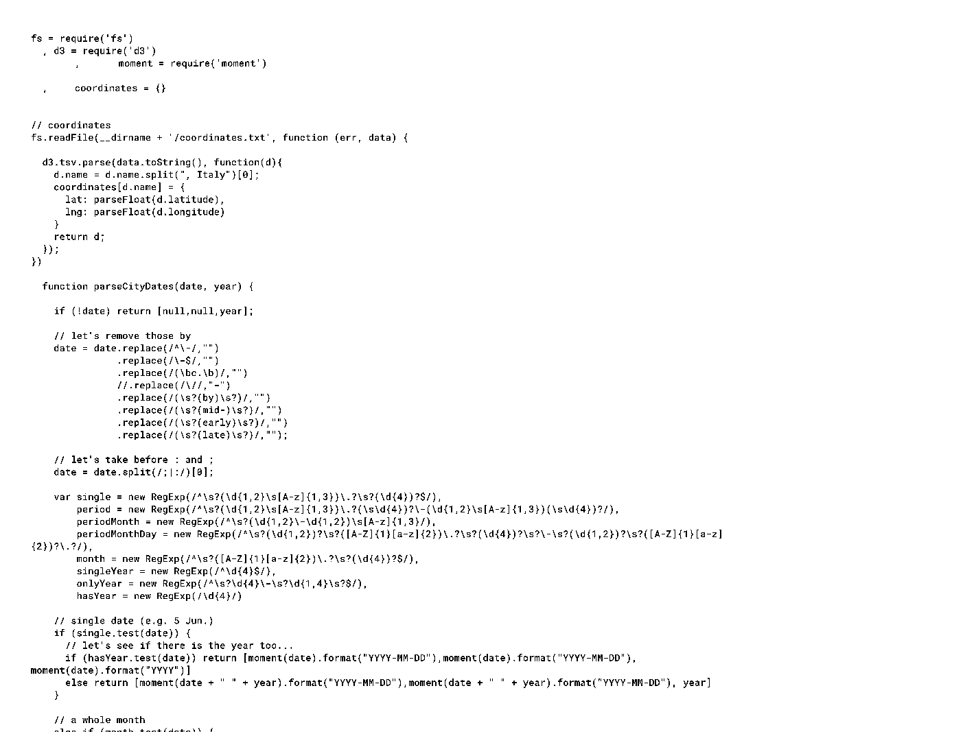
This image shows the parsing programming, written in JavaScript with extensive use of Regular Expression and ad hoc scripts to isolate and analyze textual patterns. The data that this processing retrieved constitutes the project’s MongoDB database (a robust NoSQL technology that stores information as JSON-like documents). We selected MongoDB because of its ease in handling changes and adaptation as countless iterative runs were implemented for additional parsing or refining existing results. From the start, the data was easily transferred from MongoDB to Google Sheets, which is where we assessed repeatedly (at every run) any need for changes, refinement, adjustments, error correction, or missing parts.
Google Sheets allowed us to set the entries with their unique IDs as main tabs, with the different text components (biography, travel, narrative, footnotes) placed into different columns. It also facilitated the inclusion of other tabs for additional dimensions such as education or marriages. For example, figure 30 shows an early version of the education tab, which includes columns for place of education, degree, start and end date, and “individual studied under” (a category introduced to accommodate artists who were listed as apprenticing with other artists). Cells are filled or left blank according to available information in the entries (for no individual do we have every data point filled). To be clear, the goal here was not some unattainable notion of completeness but a process characterized by integrity and systematic accountability.
Recounting Entries
With the parsing process to retrieve entries’ content set into place, we progressively refined the total set of entries to finally arrive at the 6,007 currently contained in the Grand Tour Explorer. That first step in the process of “chunking” the text file of the print Dictionary to identify the entries itself went through a transformation as we sought to bring the world of the Grand Tour to life with all the travelers that animated the pages of the Dictionary, not just those present explicitly in the entries’ headings.
After we had practiced many rounds of the new parsing approach systematically and iteratively over a few months, we took stock. Our focus had been chunking entries and retrieving data from the entries’ first two sections (the biographical and travel information). In our documentation, we reported proudly that we had identified and analyzed “5,300 entries, 5,284 tours, 14,964 single visits, and 285 unique places.” There was a sense of exhilaration and relief in our ability to provide these numbers. Up to that point, we had been unable to state how many travelers’ entries populated the pages of the Dictionary: our manual collection of travelers’ data had encountered and resolved many idiosyncrasies, but we had not worked through these systematically—instead resolving each on an ad-hoc basis; nor had we consistently documented the process. The only full measure of the scope of the Dictionary we could rely on was the publisher’s original release note stating that “this remarkable Dictionary identifies more than 6,000 British and Irish travelers who toured in Italy in the eighteenth century.” When we had a computational count of 5,300 entries identified by parsing, we assumed initially that the editors had overcounted.
What we had yet to parse were our own assumptions. We had presumed a one-to-one correspondence between entries and travelers in the Dictionary. But the particularities of the Dictionary—both in terms of the connections between many of its people and the vagaries in the historical records documenting them—made for, in many instances, a far more complex relation between entries and travelers. We started noting the variety of exceptions, from headings that only referred to other entries, to entries that held multiple travelers under a single heading. From the beginning of our digital transformation of the Dictionary, we had envisioned creating an entry for each traveler. That seemed all the more necessary as we embarked on the digital parsing with its promise of precision. Upholding this principle, though, required treating all exceptions systematically. During this process, we ended up adjusting—alternatively eliminating and adding entries—our initially parsed fifty-three hundred entries. We also came up against limits when we couldn’t be sure of the exact number of travelers in the Dictionary’s records, but we did end up with a precise notion of the amount of uncertainty contained in our own data. Ultimately, we ended up with a database containing 6,007 travelers’ entries, which is almost exactly what the Dictionary’s publisher had stated in its release note.
The first set of modifications to our count resulted from mechanical parsing errors. There were a few cases in which—possibly owing to the quality of the OCR text we had for the full text of the Dictionary—the parsing mashed together two entries, absorbing the entry of a second traveler within the main text of the previous one. The first such case we noted was the very brief entry for Harriet Cobley (travel year 1784). The one-liner “1784 Leghorn (betw. Jan and Mar.; Assheton list MSS)” had absorbed a more extensive entry—for the Irish merchant Cobley in Naples—which appeared after it in the printed pages of the Dictionary.31 Given that these two print entries were mashed under a single heading, the initial digital parsing created them as a single entry with the Entry ID of 1010. We manually created a separate new entry for Cobley the merchant (travel years 1778–80) and gave it the Entry ID of 1010.1. There are another two cases of this sort, and we found them only through manual checking.
The other cases in which we had to delete from or add to the initial fifty-three hundred entries occurred because of the Dictionary’s somewhat quirky way of dealing with historical records of past people—how those records were transformed and adapted in the Dictionary initially, and then how they were eventually recorded in our database. The discrepancies also concern issues about class and gender and how these intersect with the preservation of historical information.
The first instance of wrinkles in the noncorrelation between individual entries and individual travelers led to the number of entries actually decreasing further from the initial fifty-three hundred. On the very first page of the Dictionary, readers will notice that some entries refer to other entries. For example, on the first page, the entry for John Abbot, merchant, reads “see Francis Harriman,” sending the reader to page 467, where one sees that all that is documented about Abbot in Italy is contained in the entry of his fellow merchant, Harriman. This type of reference in the Explorer is resolved with the “mentioned names” feature: Harriman appears as a “mentioned name” for Abbot, so clicking on his name sends users quickly from his entry to reading about Abbot’s time in Italy. But many “see” references are of a different sort. Readers searching for the 8th Earl of Abercorn who follow up on the indication to “see Lord James Paisley” on page 732, for example, will realize that “8th Earl of Abercorn” is not a different traveler but merely a case of “cross-reference to senior titles” made throughout the Dictionary. As Ingamells explains in his “Note on Method,” offspring of titled families “are generally listed under the name by which they travelled,” before they succeeded their fathers.32 In this case, James Hamilton traveled in Italy in 1739 as Lord Paisley (recorded in Florence archives as “Lord Pesely” and in Leghorn/Livorno archives as “Lord Phisely”), but he became the 8th of Earl of Abercorn when he succeeded his father, the 7th Earl of Abercorn, in 1744. While it was easy to isolate all cases of cross-references indicated by “see,” only through manual checking could we identify cross-references that indicated an alternate name for the same traveler. We found three hundred. Of these, the majority are alternate names in the context of family succession, but a few differ. Eleven pertain to women: in these cases, the name change refers to marriage, and this applies for both titled and nontitled women. For example, Hannah Countess Cowper is given as an alternate name for Hannah Gore (1758-1826, travel years 1774-1826); Emma Hart after marriage became Emma Hamilton (1765-1815, travel years 1786-1800); and Margaret Murray after marriage became Marchesa Accaromboni (1746-1784, travel years 1768-1784). One instance of a cross-referenced alternate name is actually used in the Dictionary to indicate an uncertainty: this is for “Britton,” who is also reported as Bretton. We took all these into account, eliminating them from the entries list while adding them to the names list as alternate names; thus, we saw our list of individual traveler entries actually shrink from fifty-three hundred to five thousand.
In pursuit of a database in which every entry would correspond to a single traveler, we also faced the opposite: cases of “multiple-travelers headings.” For example, on the Dictionary’s page 76, the entry’s heading read simply “Belscher, Mr and Mrs,” followed by a one-line text: “1785–6 Rome (winter 1785–6; Quinn jnl. MSS).” Clearly, this referenced a married couple. We created two entries out of the original. In the Explorer database there is now one entry under the heading of “Mr Belscher” and another under “Mrs Belscher.” Beneath each, we placed the same text—the one-liner from the original entry—and attributed to both Belschers the same travel data. In terms of ID number, we eliminated the original entry ID 354 created by the parsing, replacing it with 354.1 for Mr Belscher and 354.2 for Mrs Belscher (both travel years 1785–86).
Looking systematically back through our initially parsed database entries, we found 106 in total for which the headings included more than one traveler. The great majority of them are cases of married couples (nearly 80 percent) but there are also other relationship types—predominantly, but not exclusively, family relations. There are parents and children, as well as siblings, and there are business partners (who are often also family relations). Most cases of “multiple-travelers headings” entailed two travelers under a single heading, but some instances of three and even four individuals subsumed under one entry did occur—such as the three Beaghan sisters (possibly one of the longest headings in the Dictionary: “Beaghan, the Misses, three daus, of Edmund Beaghan of Sissinghurst, Kent”). For each of these, we split the entries into multiples in order to maintain the correspondence of one entry to one individual. Separating these groups of travelers into their own entries was exciting, especially as it highlighted a number of previously invisible people, in particular women. But it also presented us with challenges due to the scant information available.
Hidden Figures: Recovering Subsumed Travelers
The final, newly created type of traveler entry that emerged in the process of making the Grand Tour Explorer database is also the most consequential and most frequently occurring, consisting of 890 entries and bringing the total entry count to 6,007. These are the entries we created for travelers for whom there were not headings in the original Dictionary. We came to call these travelers “hidden figures” because, having no original entry of their own, but rather appearing in someone else’s entry, they were subsumed under that person’s heading. It was a new use of technology that enabled us to identify these figures systematically. For the original parsing, chunking, and data extractions of the entries, we had used mostly Regular Expressions. But this approach would not help to identify people buried in the free text of the narratives, which did not have the same structured or semistructured organization of information as the biographical and travel paragraphs. Natural language processing proved to be the solution, and thanks to a student interning on the project, who was also in Dan Jurafkis’s classes at Stanford, we benefited from direct advice on how to proceed making use of the CoreNL tool kit developed by the Stanford Natural Language Group (https://nlp.stanford.edu/software/). The processing ran through the entirety of the print entries looking for entities that could be people, automatically creating lists of terms organized by relative entries. The lists had to be checked repeatedly in this reiterative process to refine the program. Our manual adjustments addressed simple confusions, resolved errors (for example, that Monviso is a mountain and not a person), and clarified ambiguities (for example, sometimes the same person might appear under different names).
It was from these lists that we systematically identified the 890 hidden figures, the large majority of whom (around two-thirds) are women. We created entries for these travelers by adding a decimal point to the ID of the entry from which they originated. In the final design of the Explorer, we left the narrative empty as both a visual reminder of how these travelers had not been featured in the headings and also in consideration of the manipulations that would have been required to extract and adapt relevant parts from the original entries. We did include, however, any information we were able to gather by examining both biographical and travel data related to them in the original entries. This was painstaking manual work, but it seemed the right decision to fully restore these travelers’ presence in the database. The amount of data we could find varied greatly; equally varied was the type of traveler we recovered through this process. For example, this was the only manner of encountering those people who were termed at the time “servants” in any systematic way and being able to see them as an aggregate. In fact, we created a new occupational category of “domestic service” to make them discoverable in the Explorer.
As stated above, roughly two-thirds of these hidden figures are women, and the largest subset within these are women whose travels had been subsumed in the Dictionary under their husbands’ entries. There are 326 such cases, and for each one we created a new entry. Some look similar to the women’s entries we created when splitting the headings of the “Mr and Mrs X” variety; indeed, there are ninety-five cases of “Mrs X” where we have only the husband’s last name. For many more, though, we also have a first name and for some, even a maiden name. This is most often the case because of rich biographical data contained in the husband’s entry, which might well record marriage date(s) and spouse name(s). Even if the narrative portion of the husband’s entry makes only cursory reference to the woman traveling as “wife,” we were able to extract her name by way of the husband’s biographical section. The richness of this type of biographical data points to the fact that many of these travelers were elite. Several were titled, and some were Grand Tourists who took multiple trips to Italy, first as young unmarried men and later with their spouses. In a few cases, British travelers married Italian women. Giulia Bellotti (travel years 1740–47) and Anna Gazzini (travel years 1734–51), for example, originated blended families with lives unfolding between the two countries; we created entries for these Italo-British wives, too, to make them fully present in the world of the Grand Tour.
Among the hidden figures there also exist—though, admittedly, more rarely—husbands whose travels were subsumed in the wife’s entry. We identified fifteen such cases where we created entries for hidden husbands. For six of these, the case is that of a British or Irish woman who married a foreign man: Mrs Cagnoni (travel year 1727) married the Italian banker and agent Joseph Cagnoni (travel years 1717–20); Sarah Goudar (travel years unknown), an Irish barmaid and author, married a Frenchman; and Mrs Conrad Martens (travel years 1764–72) was an Englishwoman married to the Dutch consul in Venice. Others married into Italian nobility. For the remaining nine cases, the wife became the entry’s namesake either because of her charisma or simply because she lived longer. Lady Hutton was in Italy with her husband, but he is never mentioned beyond their first visit in Florence and is reported dead in Bath when in fact she was still in Italy. In the case of Lady Earle (1739–1827, travel years 1770–71), she seems to simply carry the day: she traveled with her husband at all times, but most references are strictly about her. Charisma and marrying foreign combined in the instance of Hester Thrale Piozzi (1741–1821, travel years 1784–86): she traveled to Italy with her second husband, the Italian singer and composer Gabriel Mario Piozzi (travel years 1784–86), but he remained almost invisible in all others’ records, as well as in her own printed account (which became one of the most influential travel writings of the century).
Spouses—predominantly wives—are the most prevalent among the hidden figures, as well as the ones most easily accommodated within the data structure we put in place, given that marriages were among the data we had been capturing from the print entries of the Dictionary. A similarly easy fit was the case of children since our data already recorded parents. We found 192 daughters (165 drawn from their father’s entry and 27 from their mother’s) and 151 sons (126 drawn from their father’s entry and 25 from their mother’s). A hidden figure served also as our first encounter with a case of “data not available” for gender when we found reference to a “child” and not a “daughter” or “son”—for example, “the two children” stated to be living with their parents Terence and Maria O’Brien in Rome 1738–48 (see entries 3627 and 3627.3). More indirectly still, we could accommodate mothers or fathers discovered in their children’s entries, of which we found fourteen (an example is the artist Henry Thomson, of whom it is stated that he was “in Italy with his father.”) We also found hidden figures in siblings’ entries. We identified twenty sisters (twelve found in a brother’s entry and eight in a sister’s) and thirteen brothers (twelve found in a brother’s entry and one in a sister’s). For these siblings, the relationship becomes apparent in the data when parents are recorded for all siblings or, at times, by reading entries very carefully. More distant family relationships revealed by hidden figures—among whom we count seven granddaughters, two grandsons, four sisters-in-law, three brothers-in-law, four nephews, and four vaguely termed “relations”—are sparse and not recorded in the data structure. What remains interesting is the prevalence of women even among the nonspousal hidden figures—a fact that is all the more intriguing when one considers these proportions against the full data set of travelers. Whether this is the result of vagaries of preservation or of traveling trends—such as the fact that women traveling were more likely to bring along their daughters while young men were more likely to travel alone—would require more systematic investigation. Still, the question is articulated by the data itself, emphasizing the significance of maintaining gender attribution in our categorization to enable the exploring of such issues.
While by far the great majority of hidden figures are family relations of the travelers from whose entries they were drawn, we found other interesting cases. There are traveling companions (four women and seven men). There are also domestic servants, governesses, maids, and servants, for a total count of twenty-nine. Most of these remain unnamed in the database and would have stayed completely invisible if not recovered by parsing. There were, of course, many more whom we have not recovered. Most of the travelers would have been accompanied by servants or maids who remain unrecorded. The Venetian archives are a good reminder of their presence, with the records in most cases including the number of domestic workers accompanying travelers (as in fig. 31).
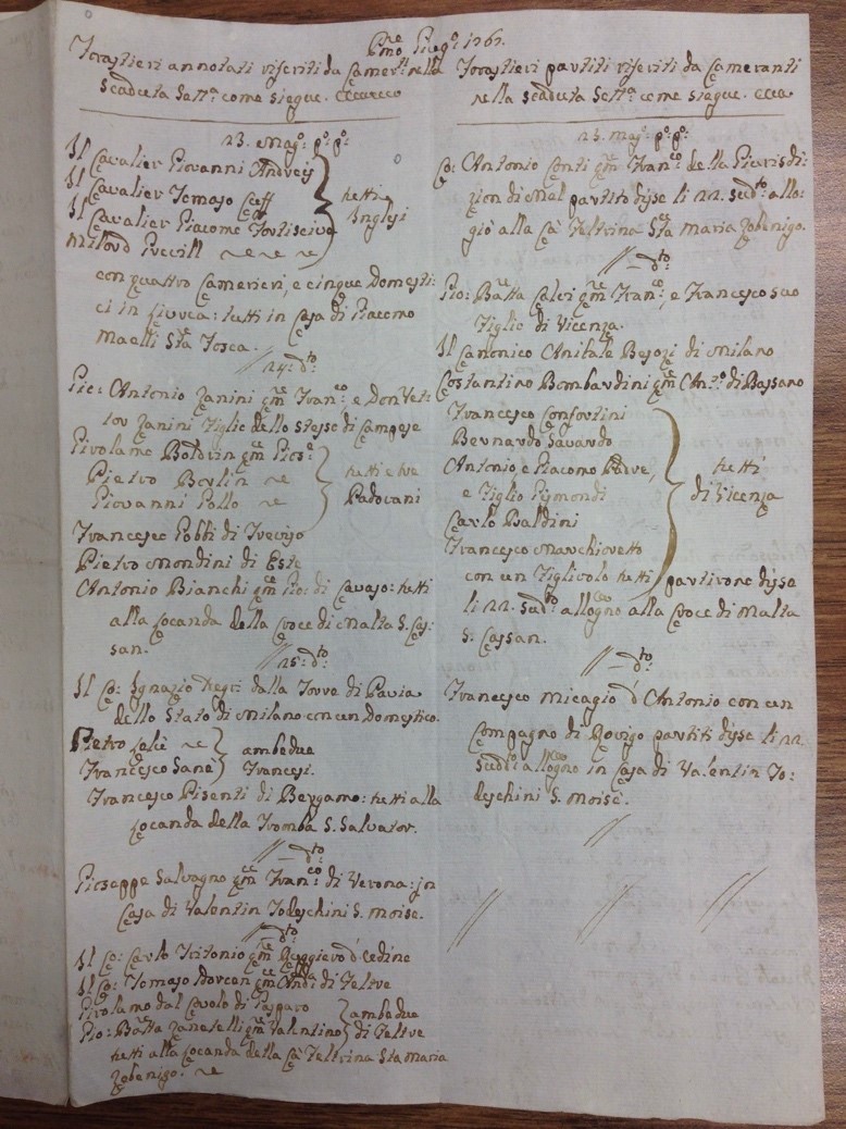
The revealing of hidden figures increased the discrepancy between how much is and isn’t known about different people in the database. For some of the hidden figures, we don’t even know their names, as in the case of most domestic workers recorded only as “servants,” and many children. Still, bringing these people into visibility with their own entries in the database, we shine light on the scale and texture of the world of the Grand Tour while also accounting for the more than six thousand travelers known already to the Dictionary’s editors.
Unidentified Travelers’ Entries
One last type of entry requires explanation: those that in the print Dictionary pertain to more than one traveler but for which there is no discernible relation besides the sharing of a common name. The Dictionary contains multiple “one-liners”—entries with only a last name and one record of a visit—most often the effect of reproducing in the entry the record of travel from an archival document or the passing mention of a traveler in a contemporary source (see fig. 32).
But sometimes a single Dictionary entry, headed only by a surname, includes records of multiple trips that appear to refer to different people who just happen to share the same surname. Figure 33 illustrates an entry that pertains to multiple travelers for whom we have only “Arthur” as a name: the “Jacobite [. . . who] died in Rome in 1716” cannot be the same person who traveled in 1733 or 1795:
Distinguishing these travelers requires knowledge we do not currently possess and that may be irretrievable. The Dictionary preserved these archival traces to make them available in case future readers and researchers might build further connections and identifications. In keeping with the Dictionary’s goal of maintaining these fragmented records for future identification, we preserved these as digital traces, despite their deviating from the one-to-one equivalence between entries and travelers.
* * *
The refinement of the parsing process used to finalize the count of the entries was foundational and represents the most consequential act of data formalization: deciding what constitutes an entry in the Explorer means deciding who gets counted. The decision to create additional entries for hundreds of women, various children, and other forgotten figures transforms the Dictionary and makes a world of travel inclusive of many more, and more diverse, people. This was active decision-making and an act of interpretation: joining quantitative historiography to qualitative historiography.
Gender is the one attribute, in addition to Entry ID, that pertains to all entries. Current debates in data practices have called attention to the prescriptive nature of this categorization’s fundamentally binary character, and I hesitated to reproduce the binary of “male” and “female,” with the third option of “unknown” when unable to assign one of the two.33 Research on gender in relation to the Grand Tour, moreover, has shown how fraught the category was regarding travels to Italy specifically.34 Italy was perceived and constructed as a land of castrati, cicisbei, emasculated Italian men, and oversexualized women, all of which was said to pose the risk of “feminization” for British tourists. I determined finally to follow this binary system because this was the basic categorization used at the time, and it was important to us to bring to the fore the women who were otherwise suppressed in most records. Not assigning gender would have kept these travelers invisible. By using the terms female traveler, male traveler, and data not available, I hope we make it clear that this is a decision relative to this project, one that reflects the use of “man” and “woman” in the eighteenth-century world of our study. One of the advantages of the dynamic structure of this digital database is that future researchers downloading it might well change this column to adapt it to different interests or additional knowledge.
Gender is only an implicit category in the print Dictionary. As we started making gender a data point, we considered various degrees of assumption-making about the travelers’ gender identities. At first, we assigned gender only by following more explicit signaling, for example instructing the parsing to identify and capture designations such as “daughter” or “son” to determine how we would qualify a traveler’s gender. Using this process, we had information for 1,776 men and 206 women. Next, we began using first names and titles to attribute gender, and when these were absent, we started checking whether “she” or “he” pronouns were used in the narrative. In the absence of all such indications, we categorized the entries as gender “data not available.” It is essential to remember that there is nothing in any of this data indicating if and how a traveler may have conceived of their gender differently than what these social categories imposed on them.
Figure 34 illustrates the full scope of our final total of entries giving a basic sense of the foundational characteristics of the database and the total count of all entries. Visualized here are the gender and origin dimensions. The entries which we created from existing ones in the print Dictionary appear as dark purple dots, and those we newly created for the hidden figures appear as dots in light grey. The grouping by gender shows how much more purple there is among the entries of female or data-not-available gender type. This is the world of travelers who, as a result of the transformation of the Dictionary, populate the Grand Tour Explorer.
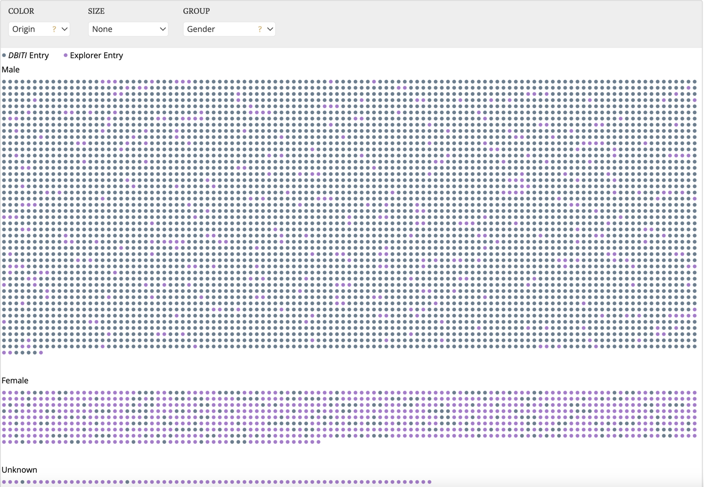
Notes
-
John Ingamells, “Preface,” in A Dictionary of British and Irish Travellers in Italy, 1701–1800, comp. and ed. John Ingamells (New Haven, CT: Yale University Press, 1997), ix, x. ↩
-
Long before the Dictionary was published, the archives that Ford was collecting on the Grand Tour provided essential material and information for many initiatives and publications, including Ford’s own articles in Apollo, the catalog for the 1974 exhibition British Artists in Rome, 1700–1800 curated by Lindsay Stainton at the Iveagh Bequest, Kenwood; the 1985 exhibition Treasure Houses of Great Britain at the National Gallery; and Anthony Clark’s Pompeo Batoni: A Complete Catalogue of His Works with an Introductory Text, edited and prepared for publication by Edgar Peters Bowron (Oxford: Phaidon, 1985). ↩
-
Handwritten notes by Ford on a 1950 typescript letter invitation from Eidos, Ref. No. PMC34/69 file 1 of 4, Margot Eates to Ford, dated Jan. 30, 1950, Paul Mellon Centre Institutional Archive, Paul Mellon Centre, London. ↩
-
See the letter from Ford to Wrinch describing the work to be done, dated March 21, 1963, Ref No. PMC34/69 file 1 of 4, Paul Mellon Centre Institutional Archive, Paul Mellon Centre, London. ↩
-
Ilaria Bignamini checked previously-searched archives but also added visits to archives in Genoa, Milan, Naples, and Turin, and researched Italian correspondences and diaries for references to British travelers. I owe details about this phase in the Dictionary’s history to the generosity of Dr. Kim Sloan, who also shared with me the typescript of her unpublished paper “The Re-birth of the Brinsley Ford Dictionary of British and Irish Visitors to Italy,” delivered at the 1997 Symposium at University College Dublin. ↩
-
Peter Mandler, The Fall and Rise of the Stately Home (New Haven, CT: Yale University Press, 1997), 124. ↩
-
See letter from Ford to Taylor dated March 24, 1964, Ref No. PMC34/69 file 1 of 4, Paul Mellon Centre Institutional Archive, Paul Mellon Centre, London. ↩
-
Cozens’ sketchbook is published in A.P. Oppé, “A Roman Sketch-book by Alexander Cozens,” Volume of the Walpole Society 16 (1927): 81–93, http://www.jstor.org/stable/41830707. For more on the notebook and Miss Bruce, see Kim Sloan, Alexander and John Robert Cozens: The Poetry of Landscape (New Haven, CT: Yale University Press, 1986), 10, 168. ↩
-
See Catherine D’Ignazio and Lauren Klein, Data Feminism (Cambridge, MA: MIT Press, 2020), chap. 4. ↩
-
RBF/1/346, letter from Ford to Taylor dated March 24, 1964, Brinsley Ford Archive, Paul Mellon Centre for Studies in British Art. ↩
-
The quote is from the handwritten notes added in interleaved pages to the Cambridge Seeley Library copy of J. H. Riedesel, Travels through Sicily and That Part of Italy, formerly called Magna Graecia, translated from the German by J. R. Forster (London: Dilly, 1773) and available in the Seeley Historical Library closed stack (ask staff for 7.17 579); https://idiscover.lib.cam.ac.uk/permalink/f/t9gok8/44CAM_ALMA21460551450003606. ↩
-
“The Republic of Letters: Between Renaissance and Enlightenment,” https://web.stanford.edu/dept/fren-ital/rofl/index.html. ↩
-
The history of Mapping the Republic of Letters has recently started to be told, beautifully, by one of its founders; see Dan Edelstein, “Mapping the Republic of Letters: History of a Digital Humanities Project,” in Digitizing Enlightenment: Digital Humanities and the Transformation of Eighteenth-Century Studies, ed. Simon Burrows and Glenn Roe (Liverpool: Liverpool University Press, 2020), 73–87. See in the same volume, for the design approaches, methods, and tools developed within the context of Mapping the Republic of Letters, Nicole Coleman’s “Seeking the Eye of History: The Design of Digital Tools for Enlightenment Studies,” 221-246. See also Meredith Hindley, “Mapping the Republic of Letters,” Humanities 34, no. 6 (Nov.-Dec. 2013): https://www.neh.gov/humanities/2013/novemberdecember/feature/mapping-the-republic-letters. ↩
-
For the presentation of this interactive visualization, see https://web.archive.org/web/20200513222037/https://web.stanford.edu/group/toolingup/rplviz/papers/Vis_RofL_2009.pdf and read its feature in the New York Times by Patricia Cohen, “Digitally Mapping the Republic of Letters,” ArtsBeat (blog), New York Times, Nov. 16, 2010, https://artsbeat.blogs.nytimes.com/2010/11/16/digitally-mapping-the-republic-of-letters/. ↩
-
See https://web.archive.org/web/20191008220635/https://news.stanford.edu/thedish/2016/06/03/visualization-tool-prototyped-by-stanford-humanities-scholars-aids-the-investigation-of-panama-papers/. ↩
-
For an overview of the project and its outputs, see http://republicofletters.stanford.edu/index.html. ↩
-
Protovis, D3, JavaScript libraries, MongoDB, and Neo4j were all developed between 2008 and 2014. ↩
-
See the foundational work done by this project at http://web.stanford.edu/group/spatialhistory/static/. ↩
-
Sarah Murray also mapped the travels of three other eighteenth-century travelers whose accounts survive. This was a painstaking work that allowed her to make an argument about change in travel patterns and infrastructure over the course of the eighteenth century. She was able to show, for example, that at the end of the century Colt Hoare traveled by land, while previously this was impossible, with various bits necessarily done by sea. But for this work, Murray had to venture well beyond the Dictionary, supplementing its data with additional research in various travel journals. See her “Spatial Analysis and Humanities Data: A Case Study from the Grand Tour Travelers Project,” in The CESTA Anthology, ed. Jake Coolidge (Stanford, CA, 2013), 39-44. ↩
-
See Joseph Priestley, A Description of a Chart of Biography (Warrington, 1764); Daniel Rosenberg, “Joseph Priestley and the Graphic Invention of Modern Time,” Studies in Eighteenth-Century Culture 36 (2007): 55–103, doi:10.1353/sec.2007.0013; and Rosenberg’s project on Priestley’s visualization work, conducted in collaboration with the University of Oregon’s Infographics Lab at https://infographics.uoregon.edu/projects/priestleys-timelines/. ↩
-
See all projects that cooperated in this phase of Mapping the Republic of Letters: http://republicofletters.stanford.edu/publications/. ↩
-
See, e.g., Bruce Redford, Dilettanti: The Antic and the Antique in Eighteenth-Century England (Los Angeles: J. Paul Getty Museum, 2008), 44. ↩
-
Giovanna Ceserani et al., “British Travelers in Eighteenth-Century Italy: The Grand Tour and the Profession of Architecture,” American Historical Review 122, no. 2 (April 2017): 425–50, https://doi.org/10.1093/ahr/122.2.425. ↩
-
Howard Colvin, A Biographical Dictionary of British Architects, 1600–1840, 4th ed. (New Haven, CT: Yale University Press, 2008). ↩
-
Colvin’s first edition, a massive and transformative reference, came out in 1954, and each architect’s entry lists all buildings that had been identified as connected to that architect. The 1975 (second) edition expanded its scope both in time (extending back to 1660 from its original 1664 limit) and in space (including Scottish and Welsh architects alongside the English). Finally, a third edition was released in 1995, which is the basis for the 2008 (fourth) edition we consulted. The respective works of Ingamells and Colvin pertain to the same twentieth-century era of archival research and systematization of knowledge; here, reference to Colvin is important to understand our work on the sixty-nine architects and how it figured in the development of the project at large. ↩
-
Colvin’s work was well-known and consulted by many who worked on the Grand Tour Dictionary, and the two projects share distinctive institutional similarities: while the first two editions of Colvin’s Biographical Dictionary were published by John Murray, the third was made possible by the Paul Mellon Centre in London jointly with Yale University Press, and Colvin’s archives are now in the Paul Mellon Centre—just like the Brinsley Ford Archive of the Grand Tour Dictionary. ↩
-
Quoted in Howard Colvin, “What We Mean by Amateur,” in The Role of the Amateur Architect, ed. Giles Worsley (London: Georgian Group, 1994), 4. ↩
-
Colvin, Biographical Dictionary (2008 ed.), 745. ↩
-
Stefano Menini, Rachele Sprugnoli, Giovanni Moretti, Enrico Bignotti, Sara Tonelli, and Bruno Lepri. “Ramble On: Tracing Movements of Popular Historical Figures,” in Proceedings of the Software Demonstrations of the 15th Conference of the European Chapter of the Association for Computational Linguistics, ed. André Martins and Anselmo Peñas (Valencia, Spain: Association for Computational Linguistics, 2017), 77–80, https://aclanthology.org/E17-3020/. ↩
-
For a close reading of the significance of algorithms as human made, see Catherine Nicole Coleman, “Computer Vision and Cultural Heritage: A Case Study,” in Artificial Intelligence for Cultural Heritage Organisations across the Atlantic, ed. Lise Jaillant, Claire Warwick, Paul Gooding, and Katherine Aske (London: UCL Press, 2024). ↩
-
A Dictionary of British and Irish Travellers in Italy, 1701–1800, comp. and ed. John Ingamells (New Haven, CT: Yale University Press, 1997), 221-22. ↩
-
John Ingamells, “Note on Method,” in A Dictionary of British and Irish Travellers in Italy, 1701–1800, comp. and ed. John Ingamells (New Haven, CT: Yale University Press, 1997), xvi. ↩
-
See, e.g., Miriam Posner, “What’s Next: The Radical, Unrealized Potential of Digital Humanities,” in Debates in the Digital Humanities, 2016, ed. Matthew K. Gold and Lauren F. Klein (Minneapolis: University of Minnesota Press, 2016), 32–41; and D’Ignazio and Klein, Data Feminism. ↩
-
See Paula Findlen, Wendy Wassyng Roworth, and Catherine M. Sama, eds., Italy’s Eighteenth Century: Gender and Culture in the Age of the Grand Tour (Stanford, CA: Stanford University Press, 2009). ↩